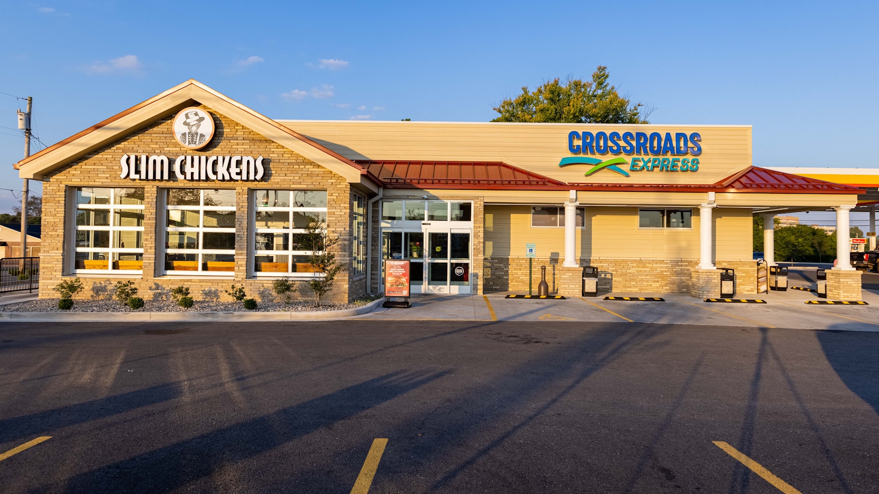
The Crossroads Express Flagship C-Store in Bowling Green, Kentucky
Houchens is a Kentucky-based, employee-owned company that owns and operates over 300 grocery stores, neighborhood markets, and convenience stores.
Since 2005, Houchens has successfully designed, built, and operated Crossroads IGA groceries and Crossroads IGA fuel-market hybrids. Each Crossroads IGA includes a fuel station, a quick-service restaurant, and a small grocery market.
Houchens’ plan was to launch a new store format, called Crossroads Express. Created to serve a greater number of customers on smaller, one-acre sites, it was conceived as a fresh convenience store housing a QSR. The company sought a c-store design solution that would lend itself to a large-scale rollout.
With this launch, Crossroads Express would embrace the convenience store trend toward healthier food and higher quality beverage and snack options (read more about this in our Insight, Convenience Stores Go Upscale.)
The company vision was for Crossroads Express to be “the best part of a convenience store, re-imagined.” Its Fresh Shop Market would feature hot and iced coffee, grab-and-go meals, fresh cut fruit and healthy snack options. The client cited inspiration from Whole Foods when describing the feeling they wanted their mid-to-upmarket customers to experience when shopping in the new c-stores.
Each Crossroads Express location would also include one of several QSR brands as well as Shell fuel and charging stations for electric vehicles. (Shell plans to install 500,000 EV charging stations by 2025.)
Competitive differentiation would center on being the “fresh leader” and providing top quality prepared foods. In this space, Crossroads Express would compete with Sheetz and Speedway. Naturally, the stores would also compete with grocery stores and other QSR providers.
Discovery
The King Retail Solutions design team met with Houchens executives on site, touring significant locations and discussing the background for this project. Though the company had an internally-developed design concept for Crossroads Express, they were open to a new approach.
The C-Store Design Concept Process
The KRS team began the creative process by exploring several viable yet distinct approaches. Our creative team did a design exploration, providing three unique directions that would lead to a perfectly fitted and distinct store image.
This “multiple choice” creative methodology helps to stretch and expand thinking in several directions, inviting a dynamic collaborative process with the client. After all, clients know their own brands best, and the KRS design team is there to support its expression in the most effective way—not to dictate a solution.
Design Concept Phase:
Exploratory collections of images to illustrate specific design directions that expressed the Crossroads Express brand.
Rough layout schematics in the form of bubble diagrams, based on our Discovery. (Houchens provided the store schematic and target merchandising goals.)
Preliminary color and material palettes.
KRS then made an online presentation to Houchens to review the store image concepts and space plan. The group actively discussed the direction of the store image and offered their response to the options presented. We then developed a consensus on the best approach.
The conceptual phase of the project took about two weeks to complete.
Store Planning & Visual Merchandising
The KRS approach to store planning is systematic, efficient, and effective. We utilize our learning to synthesize a plan that works for both the company and its target customers, prioritizing the retail customer experience. Top of mind is always the intersection of customer experience flow and operational logistics.
Our first step was to evaluate several existing locations and see what was working and what needed to be improved.
Discovery Field Observations:
- While the value proposition for Crossroads Express centered on fresh food, including high quality grab-and-go offerings, freshly prepared salads, and cut fruit, the store was not clearly conveying this message through its layout or signage.
- Category management was loose, with unrelated products merchandised together.
- The drive-through pickup window for the QSR was not branded or visible from the main road.
- The outdoor patio felt like an afterthought, and didn’t have architectural connection to the brand. Outdoor seating is essential to the “fresh” and “healthy” brand message that Crossroads Express wanted to convey at its locations.
- The scale and placement of equipment in the space needed to be carefully thought out to improve both presentation and flow. Beverage walls overwhelmed the space, while ice cream machines’ placement felt random and juxtaposed with unrelated merchandise.
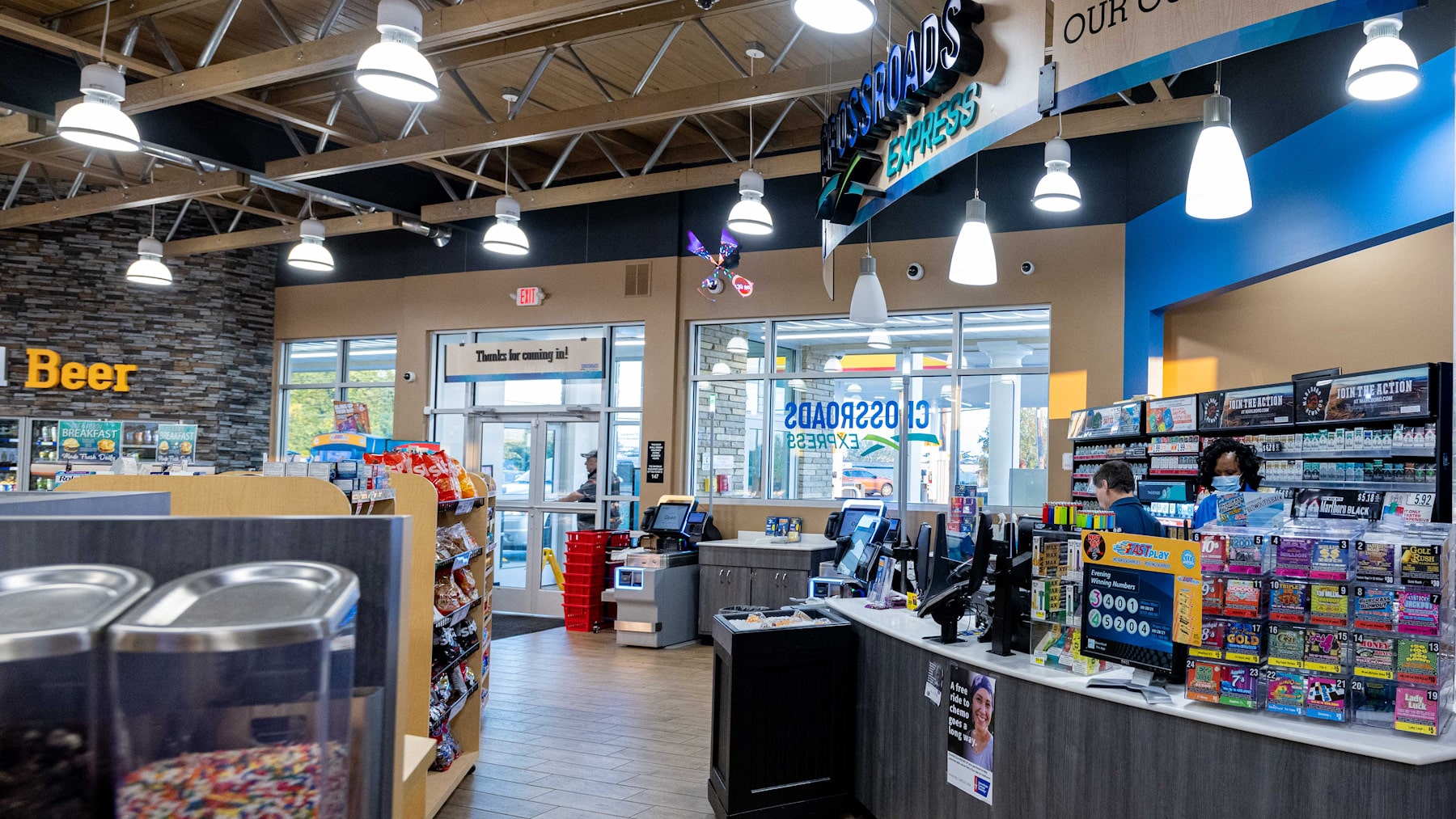
- The front counter layout, placement, and merchandising needed to be optimized.
- Architectural elements, such as canopies, soffits, and lighting, needed to better define the space and highlight focal elements.
Initial Project Stages
"Each stage was followed by an online meeting to receive client feedback, refine our understanding, and gain consensus on the key elements of a final store plan," explains Shaun Londahl, President of King Retail Solutions. "The goal was to develop an optimal, functional store layout that would then form the basis for the creative, design process."
Many of these stages occurred concurrently. The total design project took about four months to complete.
Stage 1: Assessment and Rough Store Planning
- Assessed Houchens’ rough store layout concept and equipment
- Developed three schematic layout studies to show viable options
- Conducted a traffic (shopping pattern) study and assessed entry/exit flow
- Established the store’s primary focal points
- Generated rough equipment placement and generic specs
- Generated rough category placement
Stage 2: Preliminary Store Layout
- Drawing on Houchens’ feedback on our layout studies, developed a proposed floorplan
- Made large equipment recommendations and fixture placement
- Offered operational recommendations as needed
- Conducted another traffic (shopping pattern) study, entry/exit flow
- Refined category placement
Stage 3: Refined Store Layout
- Refined fixture plan based upon prior exploratory steps
- Recommended equipment list and cut sheets
- Made small equipment recommendations, including placement
Stage 4: Final Planning
- Produced final fixture plan (which excluded refrigeration and/or HVAC design and engineering)
- Developed final equipment schedule, spreadsheet, and booklet
- Custom millwork placement and sizing
Creative: Interior Design Development
Following the approved direction and finalized fixture plan, the KRS team began the final Design Development. We developed and detailed the concepts throughout the store to provide the image and customer experience Houchens desired while maintaining a keen focus on the differentiation needed for success—especially the brand’s emphasis on freshness.
The interior design reflected the company’s customer preferences and the brand’s personality while working in unison with the Crossroads Express layout to deliver a holistic, customer-centric experience.
Interior Design Concept Drawings
It was now time to develop the visuals needed to illustrate the new c-store design concept in detail.
All design concept drawings were produced in full color, and included:
- A 3D model of the interior design
- 10-12 Interior renderings
- Interior elevations
- Interior ceiling plan
- Interior finishes, including color and material specifications
- Interior furnishings, custom fixtures, and millwork
- Graphics and signage concepts
We conducted another online presentation to review the final design concept, after which KRS compiled and crafted a final presentation that included all planning and design. This session was attended by the KRS Creative Director and Senior Designer, with results forming the final direction for completion of the project. This phase included up to 15 hours of revisions, post-presentation.
Conceptual Interior Lighting Design
Far from the icing on the cake, lighting design is critical to the look and feel of a retail establishment. Lighting evokes a specific mood, and also acts as a subtle guide for the customer journey, directing the eye within the space. Lighting, more than any other design element, elicits an instantaneous emotional response.
“One of the things our designers noticed during our on-site tour was flat, dimensionless lighting in the concept store,” reports Londahl. “Over-lighting often happens in retail design due to concerns that merchandise will not be properly illuminated. But when all areas of the store have the same type of illumination, departments blend together and feel undifferentiated.”
The KRS lighting design at Crossroads Express provided for effective merchandise illumination while evoking the brand attributes of freshness, energy, fun, and quality.
Each lighting specification for the stores also accounted for local conditions, codes, distribution, energy, and maintenance requirements. Electrical engineering was the purview of the project architect/engineer.
Lighting Deliverables
- Selection of fixtures and photometric evaluation to meet minimum performance standards for designed spaces
- Fixture location and mounting plan
- Set fixture specifications
- Set lamp specifications
- Detailed fixture schedule cross-referenced to architectural drawings and cut sheets, listing fixture type, general description, manufacturer, catalog numbers, lamp types, and lens and louver requirements.
Conceptual Exterior Design
It was essential that the exterior design of the Crossroads Express stores convey the unique shopping experience found inside. We used an iconic approach to architecture and a strong graphic identity. The company’s recent architecture for Crossroads IG informed this design and served as an easily recognizable extension of the parent brand.
The prototype design specifically addressed a first archetype store while factoring in future locations via a fully branded appearance.
Exterior Design Deliverables.
- Exterior 3D perspective renderings
- Exterior elevations (primary faces)
- Exterior signage concepts and/or brand mark (may be architectural icon)
- Exterior colors and suggested materials
- Exterior building lighting (which did not include parking, landscape, or fuel canopy)
- Exterior dining area: layout, design concept, and recommended furnishings
The King creative team thought outside the typical c-store “box” for the exterior design. The embedded QSR (a Slim Chickens store) projects from the main body of the building and sets off the c-store entrance. Stone veneer, shiplap siding and a gabled barn-red metal roof are a nod to an agricultural vernacular. A color palette of soft, sandy neutrals conveys an upscale personality while allowing colorful signage to pop.
A Convenience Store Design that Evokes the Brand
The final c-store design concept was built on a foundation of natural-looking colors and materials that were key to expressing the Crossroads Express vision of freshness and quality.
- Casework and fixtures utilize a “barnwood” laminate that evokes the brand’s values of fresh, natural, and local.
- A large display window in the butcher area allows visibility into the preparation areas, reinforcing the “fresh and quality” aspects central to the new concept.
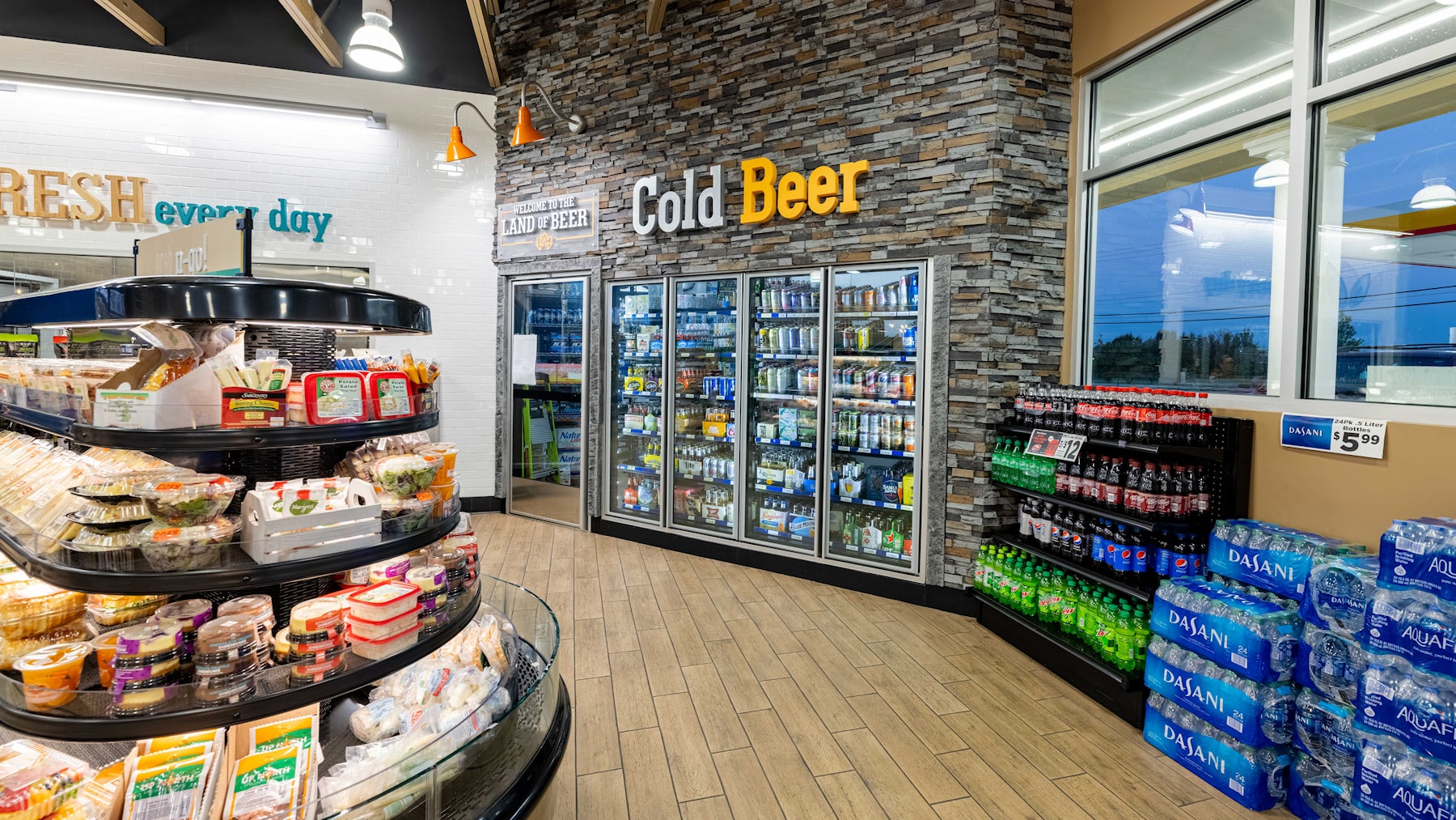
- The accent wall for the beer cold cases in the rear of the store utilizes a stone veneer to give the space a substantial, grounded feeling—not a typical message in a c-store.
- Curved fresh food cases in brushed stainless steel accent fresh offerings while guiding traffic flow in the store.
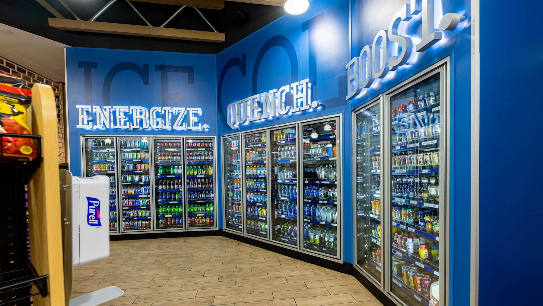
- Bold blue accent walls and oversized, backlit signage frame the cold beverage cases, where the store’s vast selection of curated beverages is displayed.
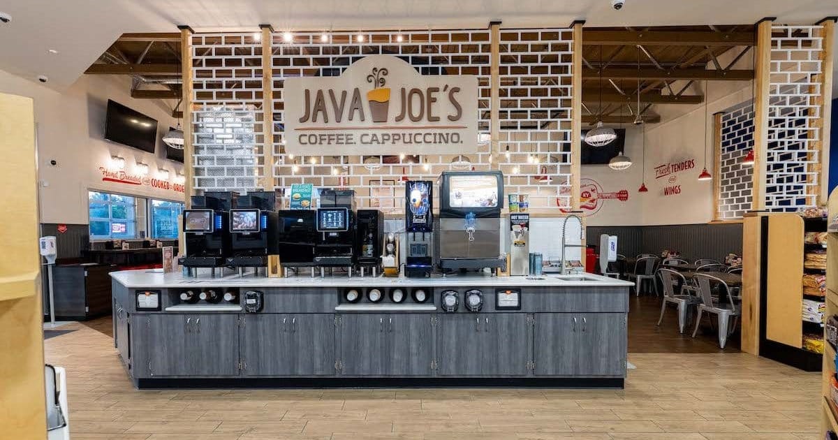
- The ice cream and fountain beverage area are set against a wall of fresh white subway tile that conveys cleanliness and simplicity; vintage-style lettering evokes mid-century soda shops.
- Much of the signage is oversized and dimensional, creating a dynamic visual impact.
- Wall washers and accent lighting, as well as lighted signage, define the store’s different categories. The general lighting for the store comes from suspended fixtures with a vintage mercantile feel rather than large surface-mounted fluorescent lights.
- See-through room dividers that evoke bricks set off the QSR while still ensuring easy visibility into the space.
Beyond Design
- KSR provided engineering and prototyping as well as production for most of the custom fixtures and decor.
- We also managed the store installation and provided program management.
A Store Design That Evolves Over Time
The KRS approach to design is resilient and evolutionary. Rather than take a hard-and-fast “cookie-cutter” approach, we recognize that each subsequent store in a retail rollout represents an important opportunity to improve. That may take the form of increased efficiencies or a more fully articulated design vocabulary. Sometimes materials or fixtures become unavailable, or new alternatives emerge that are more cost-effective or energy efficient.
Because we manufacture fixtures and decor as well as design stores, value engineering is a KRS core competency. We’re just as committed to our clients’ budgets as they are.
By ensuring that our design team remains engaged through each iteration, the inevitable adjustments required by a large rollout can be incorporated in an organized manner. To that end, we create, update, and continuously manage design documentation. This ensures that everyone stays on the same page and the design doesn’t become diluted.
As Crossroads Express began its rollout in 2021, the design-driven strategy invited new customers into the category—shoppers who might never have considered visiting a convenience store for freshly prepared food, take-and-bake meals, or specialty coffee.
“Crossroads Express stores are proving that ‘convenience’ can also mean ‘fresh’ and that ‘fast’ can also mean ‘fun’,” concludes Londahl. “It elevates the c-store from transactional to experiential.”
Summary
Houchens’ Crossroads Express flagship C-Store in Bowling Green, KY, reimagines convenience shopping by combining fresh food, upscale grab-and-go meals, QSR brands, and EV charging stations. Designed by King Retail Solutions, the project emphasized customer-centric layouts, operational efficiency, and a strong brand identity.
The design process included discovery, conceptual layouts, interior and exterior design, lighting strategy, fixture production, and rollout planning. The result is a modern, experiential convenience store that positions Crossroads Express as a “fresh leader” in the market.
Key Takeaways
- Fresh and upscale concept: High-quality grab-and-go meals, specialty coffee, and healthy snacks.
- Customer-centric layout: Optimized traffic flow, product placement, and operational logistics.
- Four-stage design process: Assessment & rough planning, preliminary layout, refined layout, and final planning.
- Interior design highlights: Curved fresh food cases, barnwood laminates, accent walls, backlit signage, and category-focused lighting.
- Exterior design highlights: Stone veneer, shiplap siding, gabled roof, integrated QSR, and cohesive brand identity.
- Lighting strategy: Balances merchandise illumination with mood-setting and guiding the customer journey.
- Operational efficiency: Fixtures and layouts designed to improve staff workflow and reduce stocking time.
- Brand differentiation: Positions Crossroads Express as a fresh, upscale alternative to traditional convenience stores.
Frequently Asked Questions
Q. What makes Crossroads Express different from other convenience stores?
A. It emphasizes fresh, high-quality food, specialty coffee, and experiential design, making convenience shopping engaging rather than purely transactional.
Q. How does KRS approach c-store design?
A. KRS uses a multi-stage, collaborative process with discovery, layout planning, interior/exterior design, lighting, fixture production, and rollout management, ensuring brand consistency and customer-focused flow.
Q. What design elements support the “fresh” brand message?
A. Barnwood laminates, large display windows, curved fresh food cases, accent walls, backlit signage, and category-focused lighting highlight freshness and quality.
Q. How does the design improve operational efficiency?
A. Optimized traffic flow, fixture placement, labor-efficient bulk stations, and modular layout planning reduce stocking time and improve staff workflow.
Q. Can the design scale for multiple locations?
A. Yes, the prototype design allows for rollout with flexibility for site-specific adjustments, evolving materials, and energy-efficient options.
