Color is one of the most powerful elements of good retail store design. On a subconscious level, color delivers visual cues to shoppers, evoking emotion and creating a specific mood.
On a conscious level, color expresses a brand’s relevance—outdated color schemes can send a message that your brand, too, is outdated.
To captivate consumers and inspire them to make purchases, store designers must interpret color trends and deploy them effectively.
But where do those color trends actually come from?
The most influential authority in the world of color is Pantone, whose products and services help define, communicate and control color from inspiration to realization.
Millions of designers and manufacturers use the company’s digital and physical color specification tools, which are designed to ensure color consistency. Whether on-screen, in print, or in pigments used to make products from fabric to coatings to plastic, the Pantone color matching system provides a global color “language”.
The Pantone Color Institute
The Pantone Color Institute, a consulting service and an outgrowth of the original business, is one of the most powerful cultural influences in the world. Though most consumers have never heard of the organization, its color trend forecasts affect their shopping experience and their purchasing decisions on a daily basis.
The Institute forecasts global color trends and advises companies on color in brand identity as well as new product development. It partners with global brands to leverage the power, psychology and emotion of color in their design strategy.
The Pantone Fashion Color Trend Report
The Pantone Fashion Color Trend Report is usually released concurrently with New York Fashion Week. While it provides a trend forecast for the American fashion industry, it’s also highly influential in interior design, especially in the retail and hospitality sectors, where frequent refreshes of decor and soft goods are required.
Each Trend Report offers a palette of ten colors that comprise its fashion-forward palette, along with five “core classics” with enduring appeal.
The nimble digital world is first to adopt colors from the trending palette, with manufacturers sprinting to catch up. Consumers subconsciously absorb the hues as they interact with marketing communication and retail offerings, and their tastes and preferences evolve accordingly.
“Colors for Spring/Summer 2022 bring together our competing desires for comforting familiarity and joyful adventure through a range of soothing and timeless colors, along with joyous hues that celebrate playfulness,” says Leatrice Eiseman, Executive Director of the Pantone Color Institute.“
As we enter this new landscape where fashion rules no longer apply, hues for Spring/Summer 2022 allow us to mix and marry as we please, encouraging the exploration of new chromatic realities, and opening the door for personalized style and spontaneous color statements.”
The company describes its Spring/Summer 2022 colors as “spanning bold brights, soft pastels, and earthy neutrals. The collection reflects the juxtaposition between our need for calm and rest and our desire for spontaneity and excitement.”
Interestingly, most of the colors in the collection are cool, ranging from plummy jewel tones like PANTONE 18-2042 Innuendo, to quiet, deep gray PANTONE 18-4004 Poppy Seed.
Just two warm notes are highlighted: PANTONE 14-0850 Daffodil, a golden yellow, and PANTONE 18-1564 Poinciana, a rich, spicy red.
Neutral PANTONE 18-1019 Coca Mocha is as close as the palette comes to an earth tone. Green is represented solely by PANTONE 16-6216 Basil.
The Spring/Summer Pantone 2022 Color Forecast
Here’s how Pantone describes the colors in its 2022 Forecast:
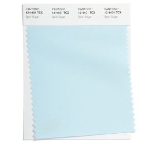
PANTONE 12-4401
Spun Sugar
Spun Sugar is a sweetened pastel with an airy nature
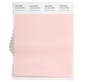
PANTONE 13-1513
Gossamer Pink
Soft and powdery Gossamer Pink has a light and tender touch.
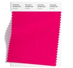
PANTONE 18-2042
Innuendo
High visibility Innuendo sends a tantalizing message.
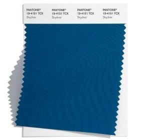
PANTONE 19-4151
Skydiver
Skydiver inspires us to new heights.
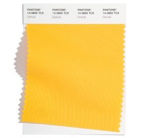
PANTONE 14-0850
Daffodil
Joyful Daffodil connects us to the spontaneity of a spring garden.
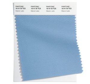
PANTONE 16-4118
Glacier lake
Calming and cooling Glacier Lake conveys serenity and quietude.
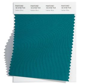
PANTONE 18-4728
Harbor Blue
Harbor Blue reflects our search for a safe space.
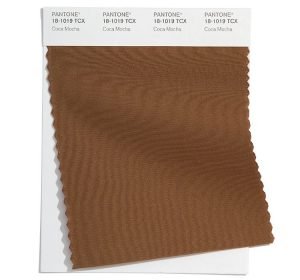
PANTONE 18-1019
Coca Mocha
Tasty Coca Mocha warms the spirit.
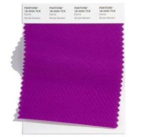
PANTONE 18-3324
Dahlia
Dahlia is a stand-out purple exuding a dynamic vibe.
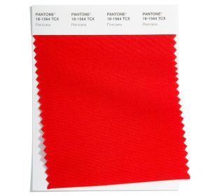
PANTONE 18-1564
Poinciana
A commanding heated red, Poinciana makes a dramatic statement.
About the Spring/Summer 2022 Core Classics:
Classic, seasonless hues whose versatility express longevity.
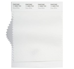
PANTONE 11-0602
Snow White
Snow White is a clean and pure white, expressive of our desire for simplicity and uninterrupted inner peace.
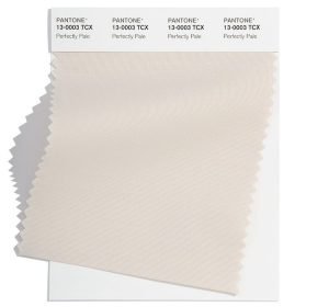
PANTONE 13-0003
Perfectly Pale
A subtle sandy beige, Perfectly Pale speaks to the soothing comfort of a warm, inviting beach.
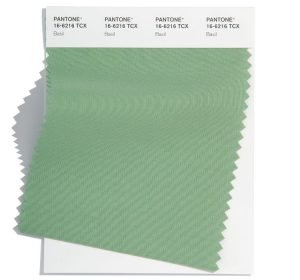
PANTONE 16-6216
Basil
Sweet and savory Basil emanates health and wellness.
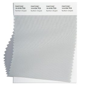
PANTONE 14-4104
Northern Droplet
Northern Droplet is a pale gray that instills feelings of tranquility.
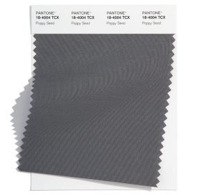
PANTONE 18-4004
Poppy Seed
The silent power of deep gray Poppy Seed contains timeless familiarity.
See the full Pantone Spring/Summer 2022 Palette
The Pantone Color of the Year
Pantone’s Color of the Year is announced with great fanfare toward the end of each year.
To choose the Color of the Year, the Institute’s experts “comb the world looking for new color influences. These can include the entertainment industry and films in production, traveling art collections and new artists, fashion, all areas of design, popular travel destinations, as well as new lifestyles, playstyles, and socio-economic conditions.”
Pantone notes that influences may also stem from new technologies, materials, textures, and effects that impact color, relevant social media platforms and even upcoming sporting events that capture worldwide attention.
How is the Color of the Year chosen? Twice yearly, Pantone convenes a secret meeting of international “color standards groups” in a European capital. Over two days, representatives make presentations and debate, ultimately selecting a color for the following year.
The Pantone View then publishes the result, which is eagerly awaited by designers in the fashion, interior, graphics and consumer products sectors.
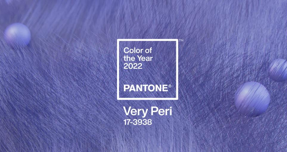
Meet Veri Peri, the 2022 Pantone Color of the Year
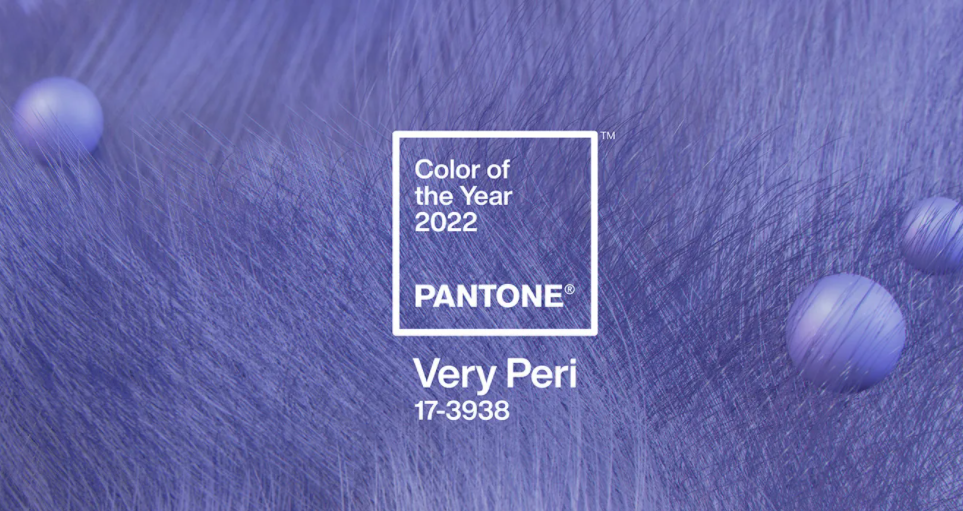
2022 is the first year that Pantone has created a new color for the Color of the Year honor. The company describes the vivid violet-blue hue as a “color whose courageous presence encourages personal inventiveness and creativity.”
“Encompassing the qualities of the blues, yet at the same time possessing a violet-red undertone…Very Peri displays a spritely, joyous attitude and dynamic presence that encourages courageous creativity and imaginative expression,” says the Vice President of the Pantone Color Institute, Laurie Pressman.
But wait, there’s more. Veri Peri is not just another pretty shade. Per Pantone:
We are living in transformative times…Very Peri is a symbol of the global zeitgeist of the moment and the transition we are going through. As we emerge from an intense period of isolation, our notions and standards are changing, and our physical and digital lives have merged in new ways. Digital design helps us to stretch the limits of reality, opening the door to a dynamic virtual world where we can explore and create new color possibilities. With trends in gaming, the expanding popularity of the metaverse and rising artistic community in the digital space PANTONE 17-3938 Very Peri illustrates the fusion of modern life and how color trends in the digital world are being manifested in the physical world and vice versa.
The Color of the Year codifies and reinforces emerging trends, making it inevitable that the mass market will see plenty of it in the months ahead.
How can you use trending colors in your store design?
- The lowest-risk place to use trending colors is in digital marketing, banner signage, floor graphics, and promotional displays.
- Trending colors can be perfect for accent walls, using paint or custom graphics
- Keep in mind that color trends don’t change dramatically from one year to the next. There’s usually a “through line” that enables graceful transitions.
- If your brand colors don’t “play well” with trending colors, there may be similar shades that can bridge the gap. Sometimes it’s a matter of lowering color intensity or adjusting the color temperature slightly.
- When building color schemes, quantity is a quality. Small amounts of trending colors can have tremendous impact and appeal in a retail store.
Color harmonies that work well with the 2022 Pantone Color of the Year
Grocery and convenience stores, as well as quick-service restaurants and institutional food service operations, favor warm color schemes and earth tones. These colors are comforting, natural and evocative of the product being sold—food.
Incorporating the right amount of Veri Peri into these environments, in the right color harmonies, sends a signal to shoppers that you’re on-trend.
Analogous color harmonies
Veri Peri can be mixed with its neighbors on the color wheel, including other blues, teals, and blue-greens, to create a lush, soothing, and upmarket effect.
This type of harmony is ideal for floral departments and personal care sections. It can also be effective for wine displays, where Veri Peri will harmonize beautifully with green glass bottles.
Complementary harmonies
Opposites attract: Veri Peri creates real chemistry when mixed with its warm complements or near-complements, including yellow, gold, and oranges and orange-reds.
Because color complements intensify each other in the perception of the viewer, they create a vibrant and dynamic mood. Use Veri Peri for an uplifting, updated “pop” in warm color schemes.
A triad of Veri Peri, poppy red, and saffron gold will have broad appeal. Adjusting the amounts of each hue will enable designers to produce a harmony that’s appropriate for retail and hospitality interiors.
Neutral Zone
Veri Peri is an eye-catching accent color when teamed up with the quiet, cool tints of the 2022 Pantone Color Forecast like PANTONE 12-4401 Spun Sugar, a pale, arctic blue. It can convey a crisp, fresh mood that enhances personal care, personal technology, and household cleaning displays within grocery stores.
Pantone offers designers four color palettes featuring Veri Peri. Each palette highlights a different aspect of the versatile color and provides up-to-the-minute design inspiration.
Trending colors give your business a lift
A store or restaurant design is built around a palette with long-term appeal to shoppers and guests. This is your “core” color message, designed to meet customer expectations.
Incorporating trending colors in the right applications communicates that your company is in touch with the zeitgeist. This creative, expressive use of color is a way to exceed customer expectations…and hopefully, your sales forecasts.
