Editor’s Note: This post was originally published in September 2021 and has since been expanded and revised for clarity.

Grocery store produce department design begins with appealing finishes and attractive fixtures—but it doesn’t end there. As more consumers embrace plant-based diets, the produce department continues its reign as the star of the grocery shopping experience and a powerful driver of customer loyalty.
The litmus test of any grocery store is fresh and appealing produce. And while it’s critical to ensure you’re not displaying tired tomatoes, bruised bananas, or sad scallions, great stores take it to another level, using every element of their produce section design to tell a story about their brand.
1. Offer food preparation ideas through produce department displays.
Shoppers who want to incorporate more produce in their diets need ideas for how to prepare less familiar vegetables and fresh fruits. Supermarkets can use produce displays to educate and inform . Instead of simply grouping types of produce (e.g., all the squash, all the tomatoes), create focused “collections.”
Just as a fashion retailer combines staple pieces and accessories to encourage additional sales, combine produce categories to invite shoppers to consider new recipes or preparations. A salad “collection” might include carrots, tomatoes, red peppers, and avocado, displayed together in an eye-catching design, such as an oversized “salad bowl” atop a round table, crowned with a display of salad dressings and packages of fresh-baked croutons from your bakery department. Stories can be as simple as a “tropical” theme that combines pineapples, coconuts, mangoes, papayas, and bananas.
Curating products from different departments is a simple, visual way to educate and inspire shoppers. Merchandise pasta and premium olive oil with fresh basil, garlic, and vine-ripe tomatoes. Carry through the theme with “recipe of the week” cards that shoppers can take with them. Even within a refrigerated case, feature displays can create visual interest.
2. Use color to create eye-catching designs.
There are three key ways to use color for impact:
The first is monochromatic color harmonies, which occur when you group items of similar hues. Clustering items of the same basic color creates a pleasing and attractive visual effect. For example, you can combine displays of radishes, tomatoes, and red bell peppers for a monochromatic red color scheme.
The second is Analogous harmonies, which comprise colors neighbors on the color wheel, such as red, orange, and yellow. Build an analogous color harmony by displaying, in succession, yellow bell peppers, orange bell peppers, red bell peppers, tomatoes, and radishes. A beautiful “ombre” effect can make your produce department Instagram-worthy.
Lastly, Complementary color harmonies are created when you juxtapose colors that are opposites or near opposites on the color wheel. This type of harmony produces a lively energy because opposite colors optically intensify one another. Try a display of yellow bell peppers next to purple eggplant, blueberries next to bright orange kumquats, and strawberries next to limes.
Create eye-catching color patterns. Varying the amount of each color in your “composition” also affects its impact–you don’t have to stick with half-and-half. While squares and rectangles are the traditional geometric patterns in stores, change things up with spirals of contrasting colors. A summer fruit display might include yellow peaches and plums arranged in concentric circles. (Don’t make things feel too precious to touch; merchandise fruit “outside” the design as well.)
Black fixtures will make produce colors appear more intense. Make sure they’re wiped down frequently to prevent any appearance of dust.
3. Tell the story. Literally!
Wine buyers have known for years that shelf talkers can boost sales. If you work with local purveyors, use signage that spotlights your farmer/suppliers, a technique used by indie grocers and Whole Foods Markets alike.
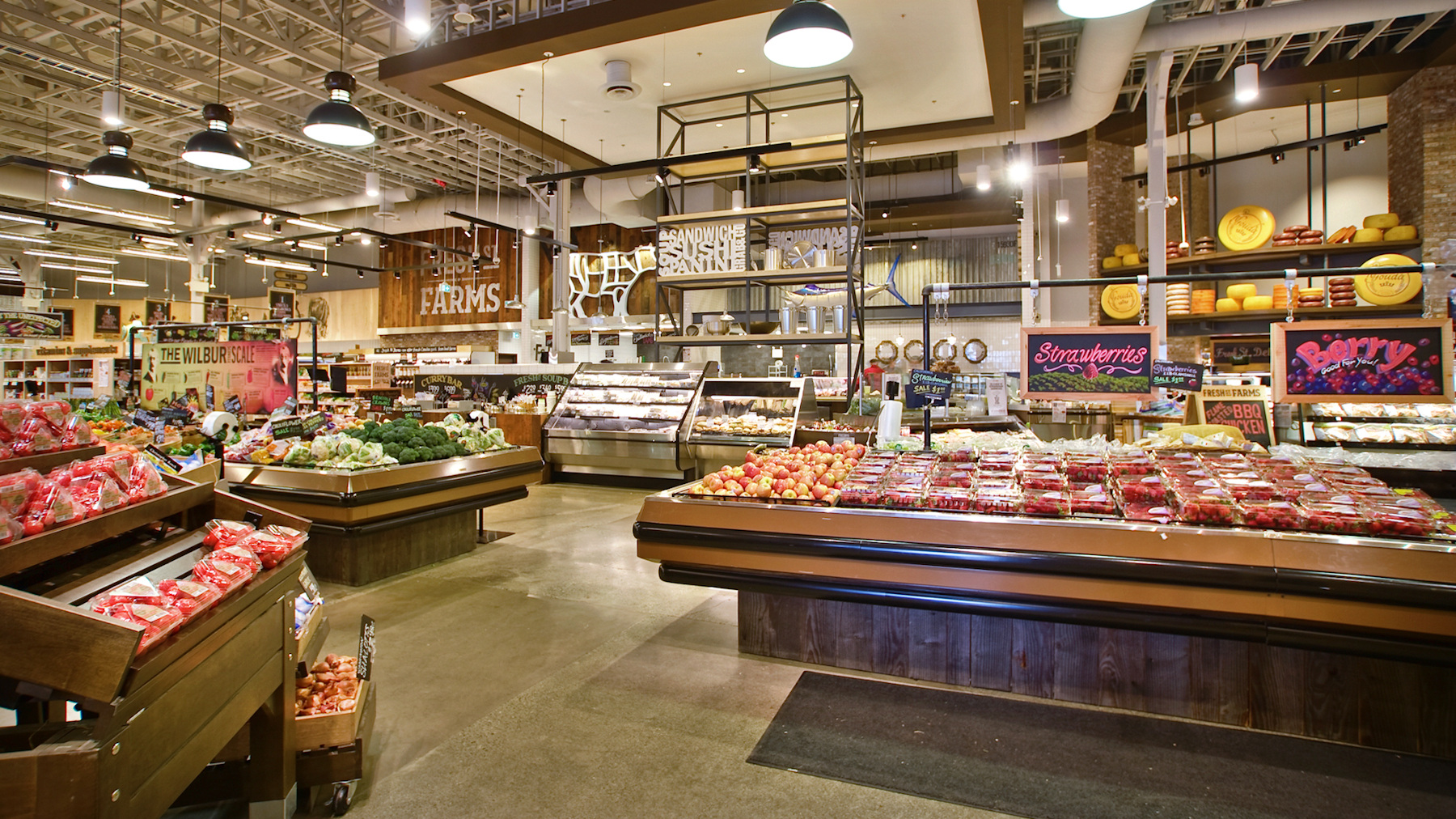
What’s unique and special about the purveyor? Try a restaurant-style chalkboard featuring the day’s star produce. Which stone fruit is juicy and ripe today? Showcase it to let shoppers know. Someone looking for fruit to eat in the next day or two will be grateful.
How should customers store specific fruits and veggies for maximum freshness? Most consumers don’t know. Offer tips to enhance their produce shopping, storage, and consumption experience.
At Elroy’s Fine Foods in Monterey, California, produce buyer Jamie Collins is a local farmer herself; there’s an oversized, hand-drawn portrait of her on the wall. Collins has innovated an exclusive distribution system where custom pallets of beautiful produce are received from neighboring farmers’ markets. That’s a story worth sharing with customers.
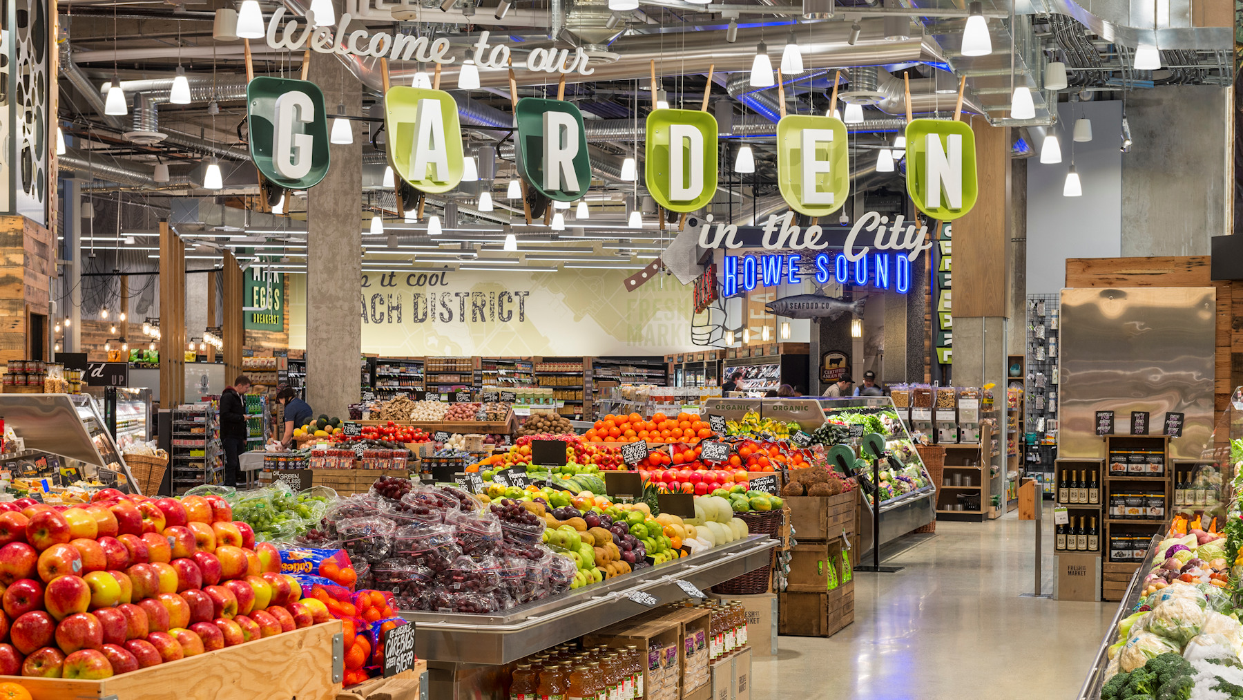
The King Retail Solutions design for Fresh St. Market in Vancouver features three-dimensional, sculptural signage with colorful mid-century flair. A line of green wheelbarrows suspended from the ceiling act as frames for freestanding letters that spell out, “Welcome to our GARDEN in the city.” The produce department design tells a vivid, upbeat “freshness” story and delivers an immersive shopping adventure.
4. Upgrade lighting for a natural look.
Another way to convey the “fresh” story is to ensure that your lighting is as close as possible to natural daylight. Full-spectrum lighting mimics the wavelength of sunlight and can be the difference between product displays “popping” and fading into the background–or worse, looking tired and unappealing.
Agricultural lighting also slows deterioration, helping to preserve produce a bit longer. When produce looks better and fresher, there is substantially less waste–in fact, the right lighting can virtually pay for itself in food waste reduction.

5. Make well-stocked, appealing displays everyone’s mission.
Prevent produce from looking picked over by patrolling your department continuously. Encourage all staff members to restore and refill displays as items are removed, especially after peak shopping periods. Customers notice when store employees tend to the produce–sending another subtle freshness signal.
Whole Foods stores are known for eye-level massing of produce, which creates excellent visual impact. A great way to give that same sense of “wow” is tiered risers and waterfall displays, which elevate produce closer to eye level. By creating the feeling of a “wall” of products, a tiered riser can create the feeling of large, abundant displays with relatively small amounts of products.
6. Guide customer movement.
The layout of the produce section plays a vital role in directing customer traffic effectively. Retailers can capture shoppers’ attention and encourage exploration by strategically positioning high-traffic items at the entrance or along the main aisles. Clear pathways and well-spaced displays ensure easy navigation, preventing congestion and enhancing the shopping experience. Additionally, using signage and floor markers to guide customers through the department can create a natural flow, allowing shoppers to quickly locate the items they need while also discovering new products. By carefully considering the layout and flow of the produce section, retailers can create a seamless and enjoyable shopping experience for their customers.
7. Facilitate product interaction.
A thoughtfully designed layout promotes meaningful engagement with fresh produce. Grouping similar items, such as fruits, vegetables, and herbs, simplifies the shopping process and facilitates quick item location. Incorporating visually appealing displays, like tiered tables or vibrant signage, highlights the freshness and quality of the produce, enticing customers to explore and make purchases.
Additionally, integrating current trends such as urban farming displays showcases innovative agricultural practices, providing customers with an interactive experience and educating them about sustainable food production. Urban farming displays can include live plants, hydroponic systems, and educational materials about urban agriculture. These displays add visual interest to the produce department and demonstrate the store’s commitment to sustainability and local food systems.
8. Highlight seasonal and promotional displays.
Seasonal and promotional displays add excitement and variety to the produce department. By highlighting seasonal fruits and vegetables alongside special promotions or featured recipes, retailers can stimulate impulse purchases and encourage customers to try new products.
Utilizing technology, such as QR codes, can further enhance the shopping experience. Customers can scan the QR code with their smartphone to access recipes incorporating seasonal items, providing inspiration for meal planning, and adding an interactive element.
Regularly refreshing displays and aligning them with holidays or culinary themes creates an immersive and dynamic shopping experience, driving customer engagement and loyalty.

9. Set the mood with the right fixtures.
The enormous popularity of farmer’s markets in the United States has thrown down the gauntlet for grocers. How can your store tell its own compelling, “fresh, local” story? One way is to choose fixtures and produce display bins with an earthier, more organic appeal.
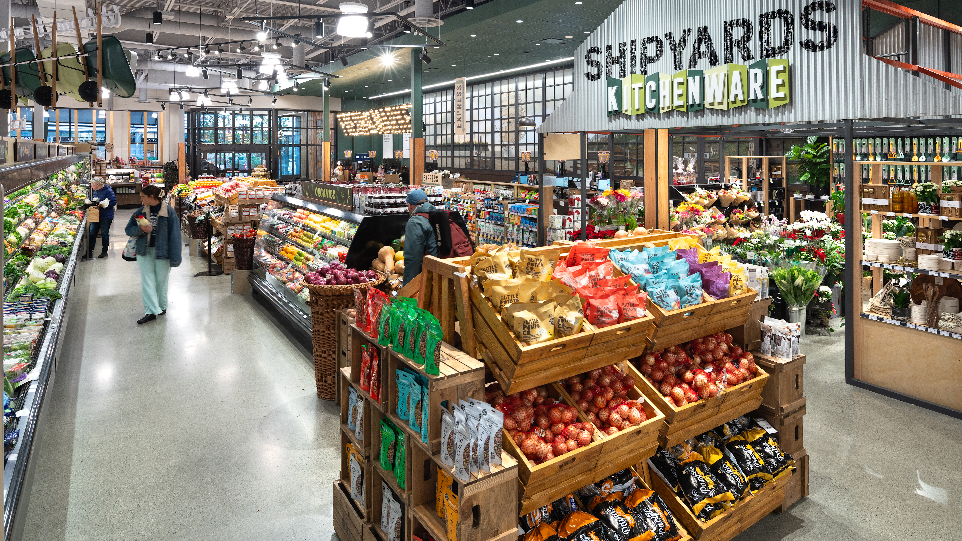
Shotted bins, European-style produce tables, and wooden carts give shoppers a sense of discovery and exploration. Remember, everything doesn’t have to match—but it does have to harmonize.
Create enough space in the produce section for small-scale activations, such as produce sampling with local purveyors. Modular and rolling fixtures in the produce section can provide flexibility for special events, tastings, and cooking demonstrations. Euro tables (so named for their resemblance to European street market tables used for food displays in the 1920s) have become a popular option.
Purchase tables with adjustable height, locking casters, and optional tilt-tops for maximum versatility. Push the envelope: combine natural wood with a powder-coating color that matches your branding. Whether your design aesthetic says, “Vintage Village Vegetable Stand” or “Museum of Modern Fruit,” the King Retail Solutions design team creates fixtures that deliver memorable shopping experiences in produce sections of every size.
The inventory in produce departments is constantly changing, so flexibility in fixtures is key. Displays like nesting tables can enable merchandising plans to pivot quickly for shipments of seasonal produce.
In Conclusion
There’s no better time to rewrite your produce story: fresh fruits and vegetables are the fastest-growing (no pun intended) food category in the grocery sector, as young consumers choose plant-based diets for themselves and their families. And with produce offering better profit margins than many other categories, a fresh new story can also yield gratifying results on the bottom line.
Summary
This guide outlines effective strategies for grocery store produce department design, covering layout, color, lighting, fixture selection, storytelling, and seasonal displays.
Well-executed produce displays engage customers, promote healthier shopping habits, reduce waste, and enhance brand identity while driving sales.
Key Takeaways
- Create themed or recipe-based displays to educate and inspire shoppers.
- Use color strategically with monochromatic, analogous, and complementary schemes to enhance visual appeal.
- Install full-spectrum lighting to highlight natural colors and extend produce freshness.
- Keep displays well-stocked, using tiered risers, waterfall displays, and nesting tables for abundance and accessibility.
- Design layouts to guide customer flow, position high-traffic items strategically, and enhance exploration.
- Facilitate product interaction through interactive displays or urban farming elements.
- Highlight seasonal and promotional items to encourage impulse purchases and engagement.
- Choose flexible and visually appealing fixtures to reinforce a fresh, local, and organic brand story.
- Regularly refresh displays and adapt merchandising to changing inventory, trends, and customer needs.
Frequently Asked Questions
Q. How can produce department design influence customer purchasing behavior?
A. Engaging displays, thematic storytelling, and strategic placement of items inspire shoppers to explore and purchase more, especially when educational or interactive elements are present.
Q. What are key factors to consider when designing a grocery store's produce department?
A. Visual appeal (color and lighting), layout for easy navigation, storytelling, cross-merchandising, signage, and creating a fresh, local feel are essential. Accessibility and smooth customer flow should also be prioritized.
Q. How can a grocery store optimize space while maintaining a wide selection?
A. Use multi-level displays, tiered risers, waterfall displays, and nesting tables to showcase a broad selection without cluttering the space.
Q. What role does color play in produce department design?
A. Color attracts attention, conveys freshness, and creates visual interest. Monochromatic, analogous, and complementary schemes guide the eye and encourage purchases.
Q. What are the benefits of using specialized lighting in produce displays?
A. Full-spectrum or produce-specific lighting enhances natural color, reduces deterioration, minimizes waste, and keeps produce looking fresh longer.
Q. What are current trends in supermarket produce department design?
A. Trends include interactive technology for education, sustainable materials, urban farming or hydroponic displays, local/artisanal/organic offerings, and experiential zones like tasting bars and cooking demos.
The ROI of Store Design Series
- Part One: How Retail Branding Drives The ROI Of Store Design: Strategies, Metrics & Case Study
- Part Two: How Store Planning & Design Drive ROI In Retail: Strategy, Flow, And Measurable Impact
- Part Three: Design Integrity in Rollout: Where Great Ideas Live or Die
