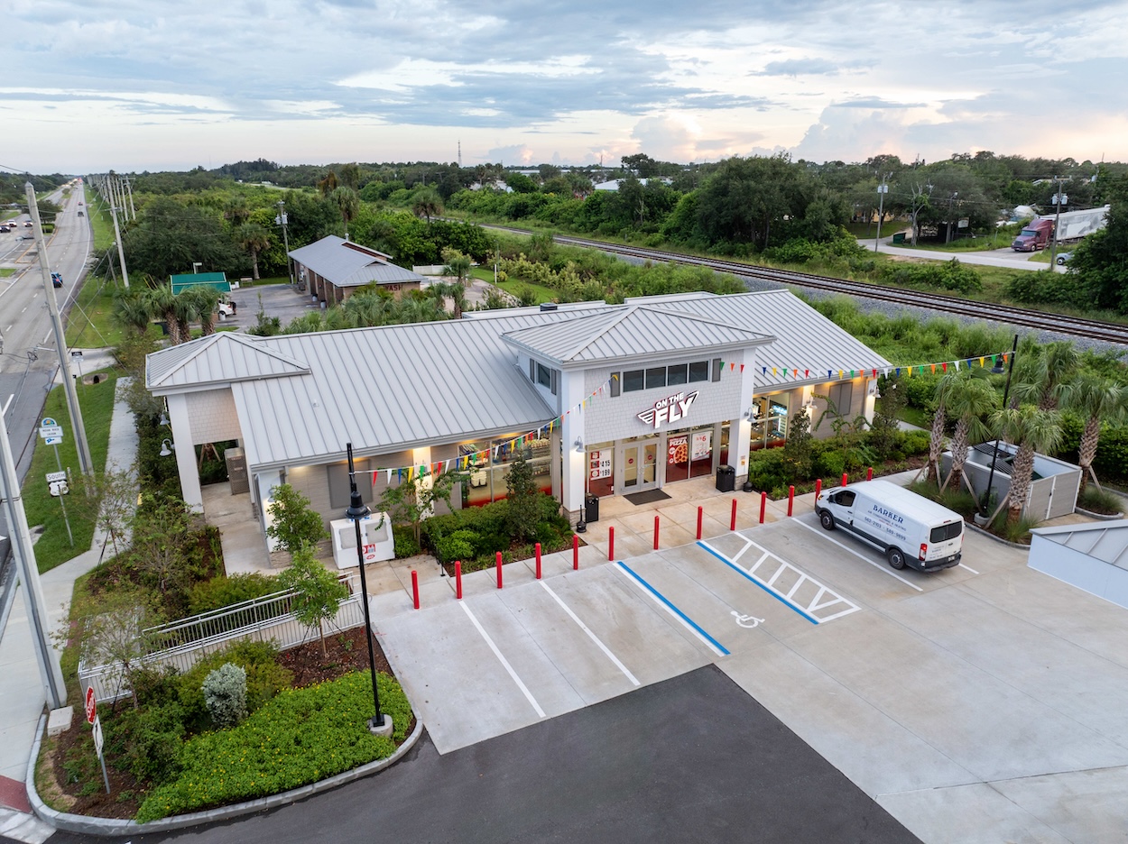
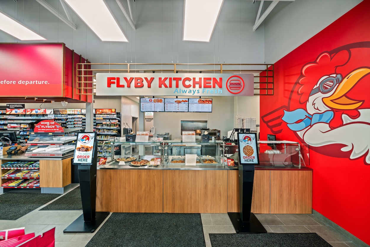
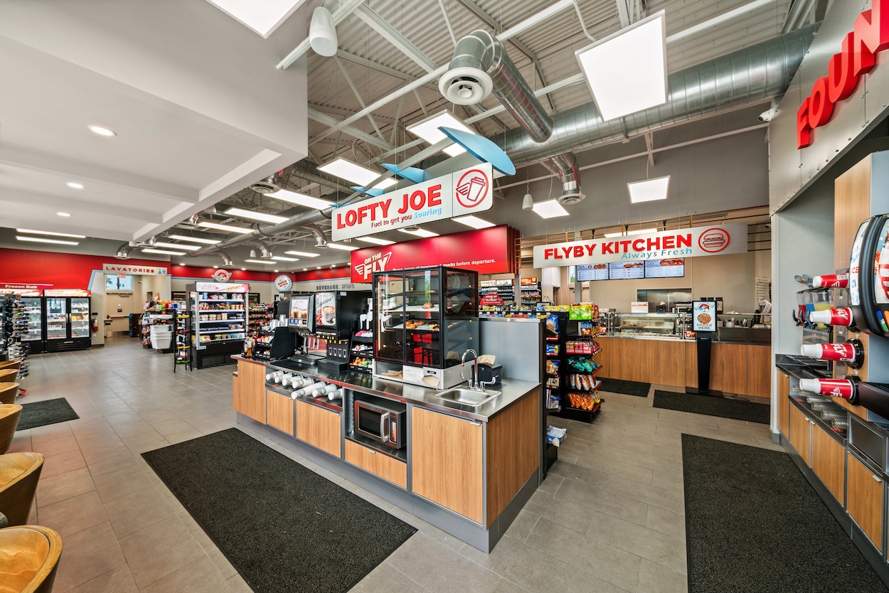
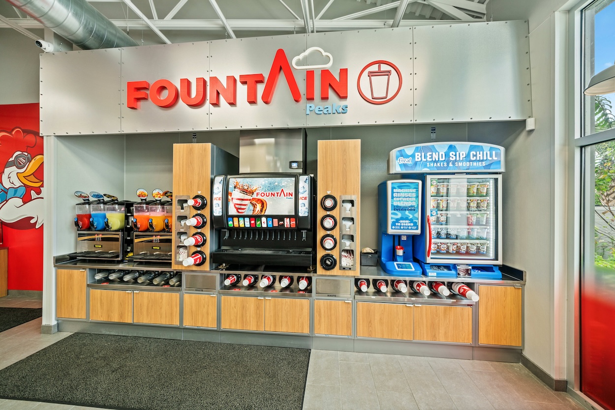
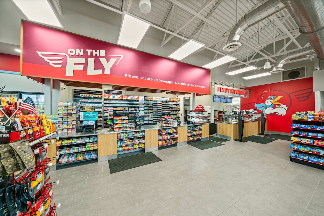
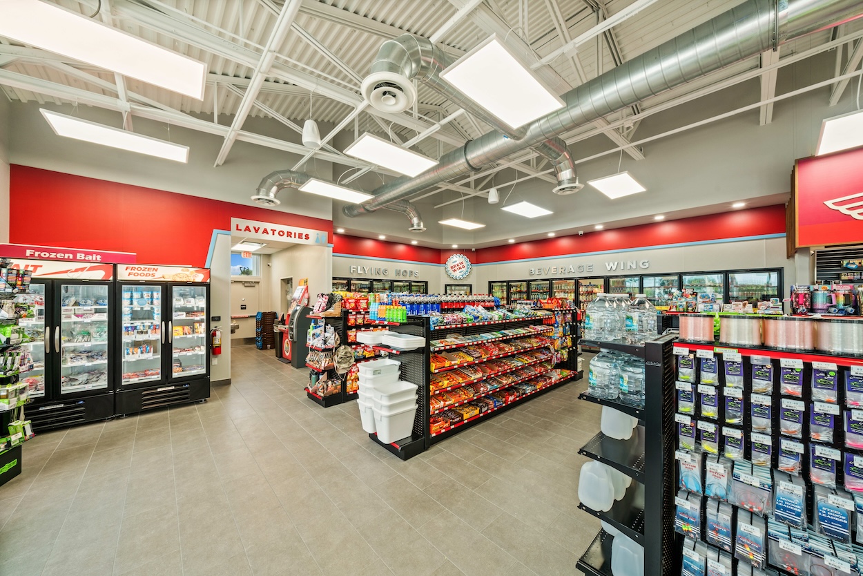
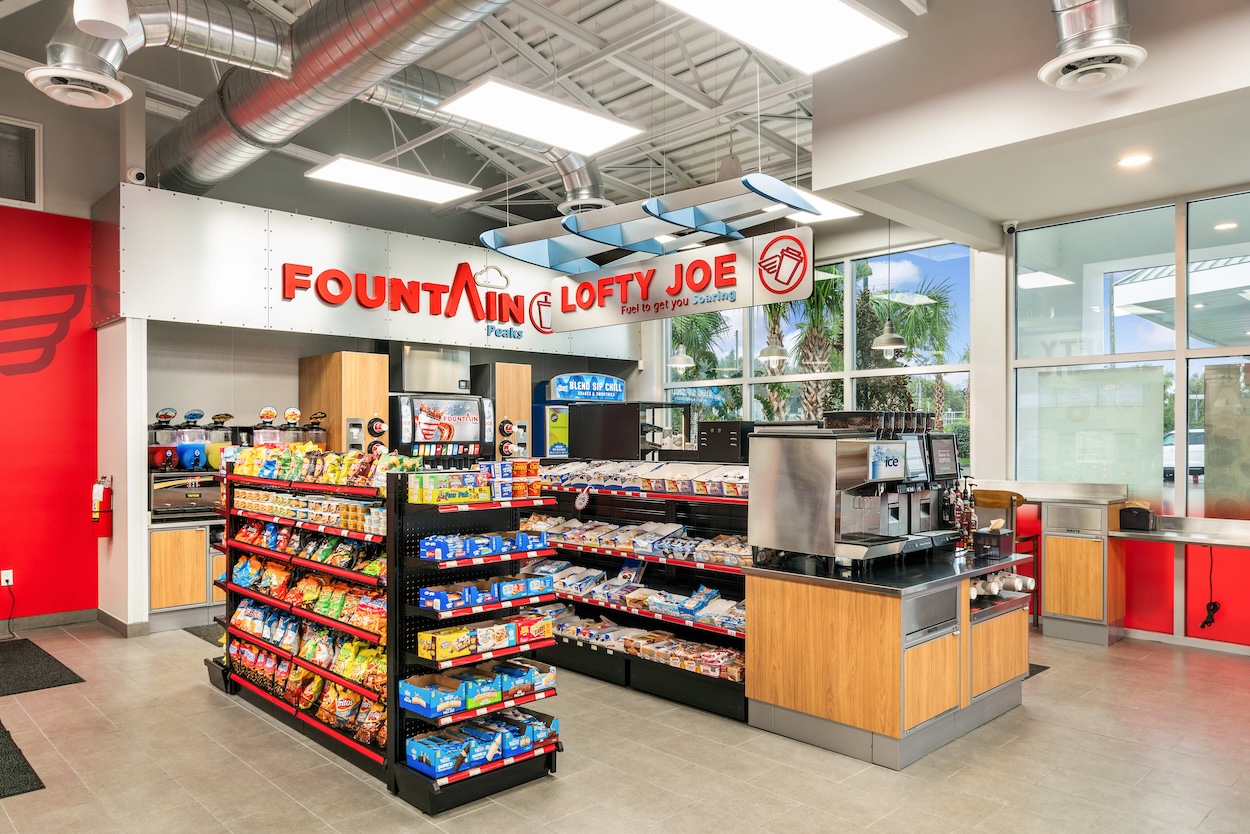
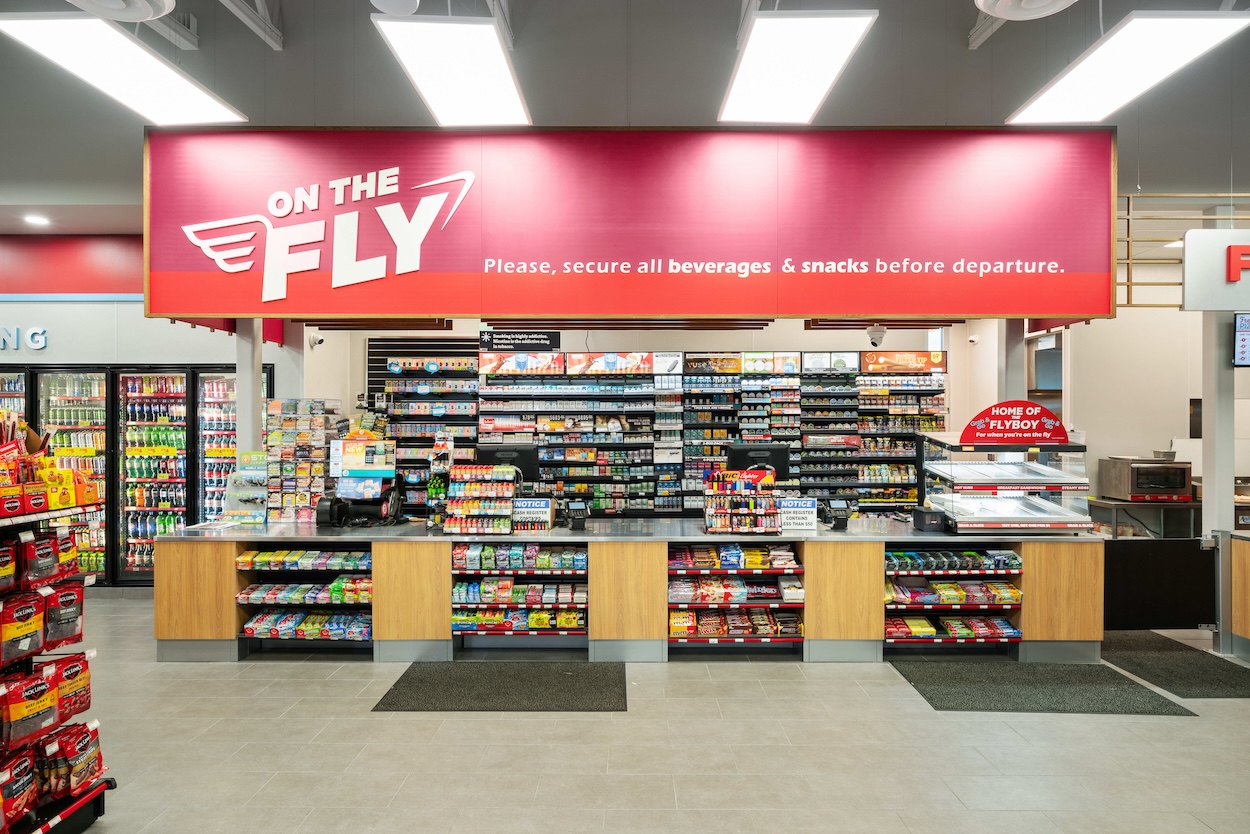
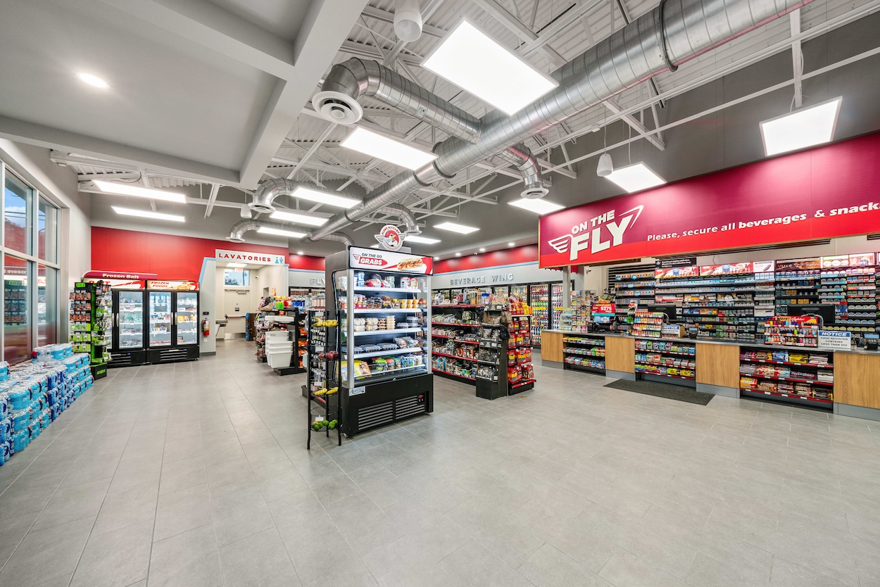
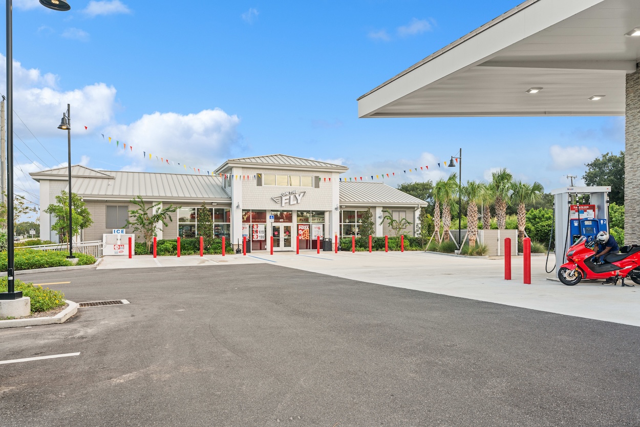
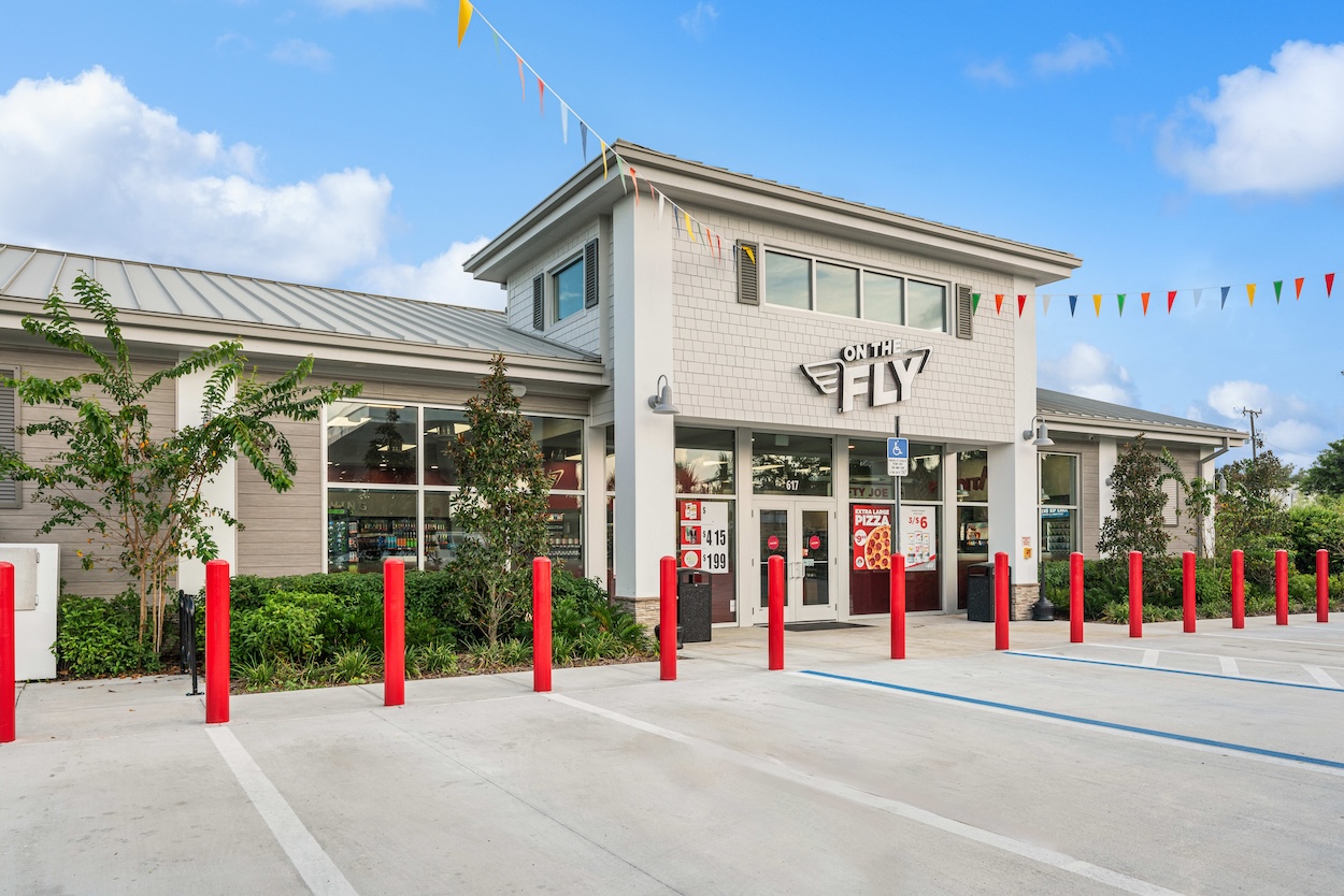
At On the Fly, it’s all about giving the customer what they need to keep moving—whether that’s a quick snack, a fresh meal, or just a place to refuel, both for their car and themselves. It’s designed to be efficient, but warm, so the customer can feel right at home while grabbing what they need to keep soaring.
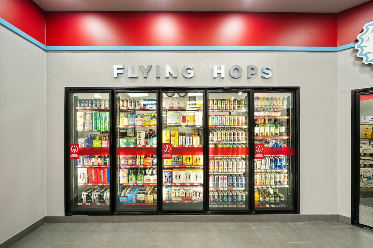
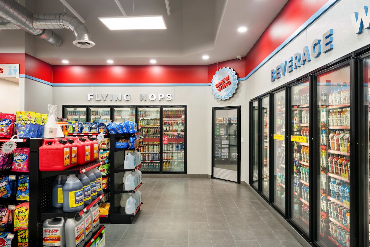
Inspired by Giant Oil’s On the Fly brand for their convenience stores, King Retail Solutions developed a concept that seamlessly blends retro air travel aesthetics with a modern twist. Drawing from the iconic TWA terminal by Eero Saarinen, the design incorporates the rich reds, burgundies, and whites of the classic terminal, with lively pops of teal for a fresh, dynamic feel.
The space evokes the nostalgia of the golden age of air travel while maintaining a clean, contemporary look. Simple geometries, sweeping graphic forms, and a minimalist material palette—featuring warm mid-tone woods and stainless steel—create a welcoming yet sleek environment. It’s a place where the design not only looks great but also serves a functional purpose, providing the essentials for busy travelers or locals in need of a quick stop.nter your text here
"KRS has been a great partner in wonderfully executing the second iteration of our aviation-themed brand for On The Fly. They brought creativity and strategic thinking to the table by taking into account the openness, innovation, and product offering we deliver to our customers, while also aligning with our business goals. Their approach and attention to detail made our team feel confident as we collaborated to evolve the brand as we expand our footprint."
