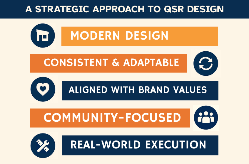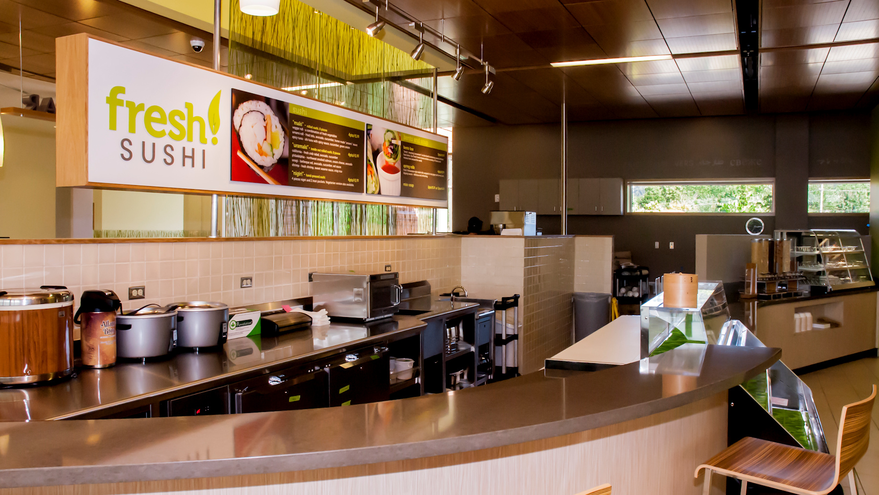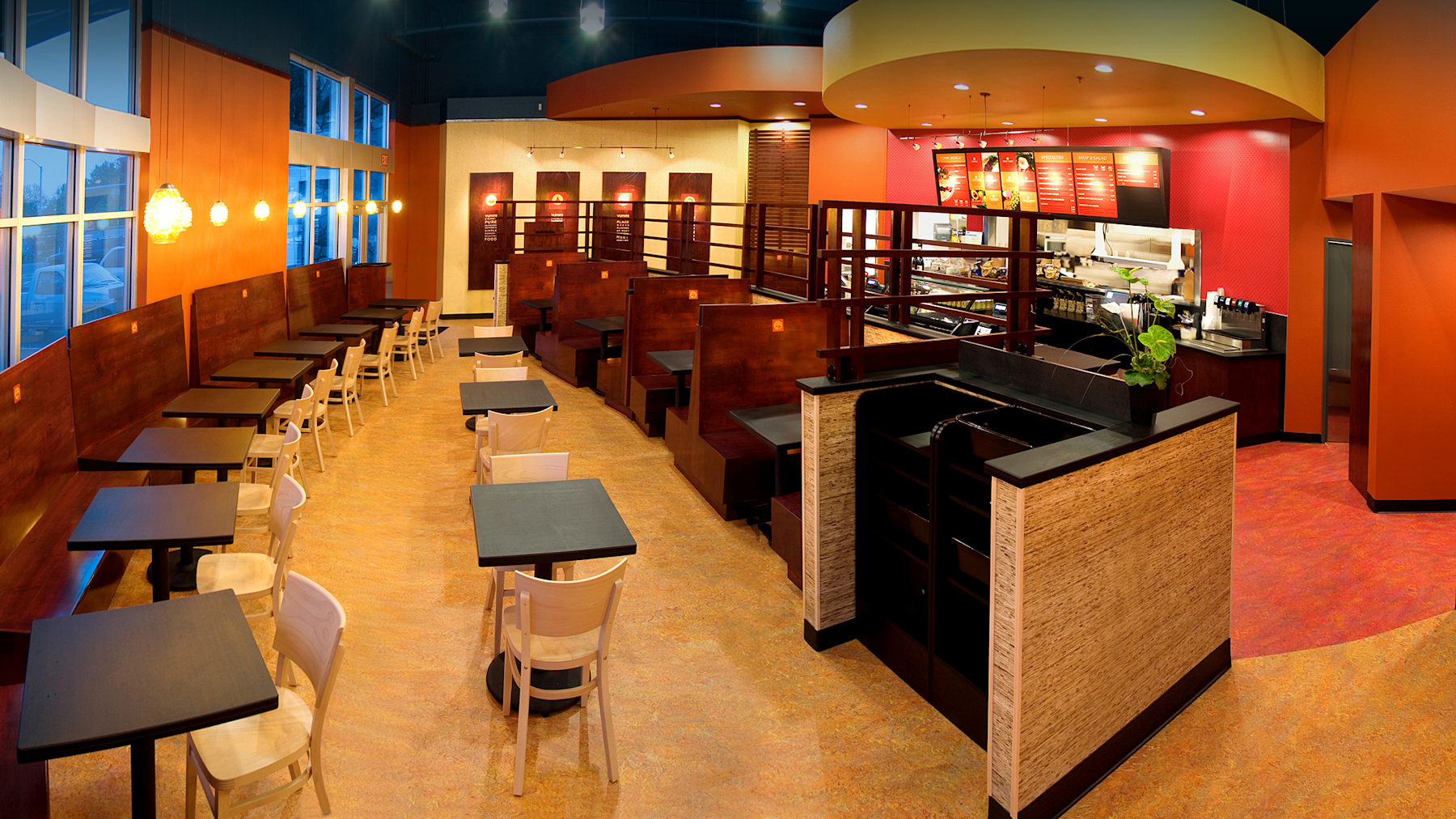
Key Takeaways
- On-trend QSR design and strong execution are essential for building guest loyalty, brand consistency, and operational efficiency in today’s fast-food industry.
- Current QSR design trends include dedicated order pickup zones, walk-up order windows, food lockers for contactless pickup, enhanced dine-in experiences, and outdoor or flexible dining spaces.
- Consistent design standards, clear brand values, sustainability, and adaptable layouts help future-proof your QSR locations and improve customer satisfaction.
- Successful QSR design implementation depends on reliable vendor partnerships, creative solutions for space and budget constraints, and a disciplined, strategic approach.
- Applying these strategies positions your QSR brand for sustainable growth and lasting competitive advantage.
From Trends to Practical Design Execution
A strong interior design concept is essential for any quick service restaurant (QSR) brand—but turning that concept into a reality is what sets successful brands apart. Today’s leading QSRs combine thoughtful design with effective execution, ensuring their spaces are both on-trend and operationally sound.
American consumers have a seemingly endless appetite for new fast-food concepts, driving the need for spaces that are innovative, functional, and true to brand. Whether you’re opening new locations or refreshing existing ones, staying on top of design trends while delivering consistent execution is key to growth. Here’s what to keep in mind as you plan your next QSR location.

Modern QSR Design Trends Shaping the Industry
QSR design continues to evolve, driven by changing consumer expectations, technological advancements, and new operational realities. Brands that stay ahead recognize that design trends are more than fleeting ideas—they are essential strategies for meeting guest needs, optimizing efficiency, and supporting growth. Here are several trends that are redefining today’s QSR landscape:
1. Order Pickup Zones
2. Walk-Up Order Windows
3. Food Lockers
4. Enhanced Dine-In Experiences
5. Outdoor Dining and Flex Spaces

Consistency: The Cornerstone of QSR Design Implementation
Consistency is a key driver of guest trust and brand loyalty in the quick service industry. Whether you’re opening a new location or updating an existing one, a unified approach to QSR design ensures every restaurant delivers the same quality experience—no matter where it’s located.
The most successful brands establish a core set of design standards—covering everything from color palettes and materials to signage and lighting—that can be replicated and adapted as needed. This approach not only strengthens brand recognition but also streamlines the rollout process for new stores and remodels.
Consistent design execution reinforces your brand at every touchpoint. When guests know what to expect, they’re more likely to return, recommend your restaurant, and become loyal advocates for your brand.
Align Design with Brand Values
A successful QSR design is more than just visually appealing—it’s a direct reflection of your brand’s core values and promises. Every design choice, from layout to materials, should communicate what your brand stands for and enhance the overall customer experience. For example:
- Sustainability: If your brand is committed to sustainability, opt for recycled materials, energy-efficient lighting, and low-impact finishes. These choices resonate with environmentally conscious guests and signal your commitment to responsible operations.
- Community: Brands that prioritize community and connection can create inviting, flexible seating areas that encourage group gatherings and foster a sense of belonging.
- Innovation: For brands focused on forward-thinking experiences, integrating technology—such as digital ordering, unique lighting, or modern fixtures—can reinforce your position as an industry leader.
By ensuring that your interior design consistently expresses your brand values, you strengthen customer loyalty and differentiate your QSR in a competitive market.
Sustainable and Community-Focused Features
Modern QSR design is about more than aesthetics—it’s about creating spaces that are efficient, adaptable, and aligned with the expectations of today’s guests. Implementing sustainable and community-focused features can provide both operational benefits and a competitive edge.
Practical strategies include:
- Durable, Sustainable Materials: Select surfaces and finishes that can withstand heavy use while minimizing environmental impact. Recycled, locally sourced, or low-maintenance materials not only support sustainability goals but also help control long-term costs.
- Energy-Efficient Lighting: Incorporate LED and smart lighting systems to reduce energy consumption, improve ambiance, and enhance the overall guest experience.
- Flexible Dining Areas: Design interiors that easily accommodate different group sizes and uses, including modular seating or convertible spaces that can transition from individual dining to community gatherings.
- Outdoor Options: Extend your brand’s reach by providing comfortable, well-designed outdoor dining areas, which can boost visibility and serve guests year-round where climate allows.

Vendor Partnerships: The Backbone of Design Execution
Achieving consistent, high-quality results in QSR design depends on building strong relationships with reliable vendors and partners. Experienced vendors understand the unique demands of fast food environments and can deliver materials, furnishings, food service equipment (FSE) layouts, and fixtures that meet both brand standards and operational requirements. Long-term vendor partnerships offer several key benefits:
- Quality Assurance: Trusted vendors help maintain consistency across locations, ensuring every site reflects your brand standards.
- Efficiency: Established relationships streamline ordering, delivery, and installation, helping projects stay on schedule and within budget.
- Innovation Access: Vendors who know your brand can introduce you to the latest materials, technologies, and design solutions—giving your QSR a competitive advantage.
By choosing partners who align with your vision and values, you position your brand for smooth rollouts and successful expansions.
Navigating Budget and Space Constraints
Every QSR project comes with unique challenges—most notably, managing costs and adapting design concepts to fit different physical spaces. Smart planning and flexible strategies are essential to maximize value without compromising the guest experience or your brand identity.
Key considerations include:
- Prioritize Impactful Elements: Focus your investment on design features that most influence customer perception, such as entryways, key finishes, and signature brand elements. Optional upgrades can be phased in as budgets allow.
- Leverage Modular and Multi-Use Solutions: Modular furniture and adaptable layouts make it possible to serve various guest needs while controlling costs. Multi-use spaces can transition between peak and off-peak uses, increasing efficiency.
- Adapt Design for Each Location: No two spaces are alike. Use scalable design packages and flexible layouts to ensure every location feels on-brand—even in smaller or uniquely shaped sites.
- Monitor Long-Term Costs: Choose durable, easy-to-clean materials that reduce maintenance and replacement expenses over time.
By approaching budget and space constraints with creativity and discipline, QSR brands can deliver a consistent and high-quality experience in any setting.
QSR Design Implementation: A Strategic Asset for Growth
Effective QSR design is more than a one-time project—it’s an ongoing strategy that drives operational excellence, strengthens your brand, and positions your business for long-term growth. By focusing on thoughtful design choices, staying on top of industry trends, executing consistently, and building the right partnerships, QSR brands can create inviting, efficient spaces that keep guests coming back.
Whether you are opening new locations or refreshing existing ones, a disciplined approach to design implementation and execution ensures every restaurant delivers on your brand promise. In a competitive and rapidly evolving market, this commitment to quality and consistency is what turns guests into loyal advocates.
Summary
From trends to practical design execution, a strong interior design concept is essential for any quick service restaurant (QSR) brand—but turning that concept into a reality is what sets successful brands apart. Today’s leading QSRs combine thoughtful design with effective execution, ensuring their spaces are both on-trend and operationally sound.
American consumers have a seemingly endless appetite for new fast-food concepts, driving the need for spaces that are innovative, functional, and true to brand. Whether you’re opening new locations or refreshing existing ones, staying on top of design trends while delivering consistent execution is key to growth.
Frequently Asked Questions
Q. Why is QSR design important for modern quick service restaurants?
A. QSR design is important because it shapes how guests experience the space, influences operational efficiency, and reinforces brand identity. Thoughtful design helps attract and retain customers while ensuring smooth workflows and an inviting environment for all visitors.
Q. What are current QSR design trends?
A. Modern QSR design trends include order pickup zones, walk-up windows, food lockers for contactless service, enhanced dine-in experiences, and flexible outdoor or multi-use dining spaces. These trends help restaurants stay efficient, on-trend, and guest-focused.
Q. How do order pickup zones improve QSR design?
A. Order pickup zones streamline traffic, separate third-party or mobile orders from dine-in guests, and reduce congestion. They ensure a smoother, more enjoyable experience and support operational efficiency for both staff and customers.
Q. Why is consistency crucial in QSR design?
A. Consistency ensures every location delivers the same high-quality guest experience. Uniform color palettes, materials, signage, and layouts reinforce brand recognition, foster customer trust, and streamline the rollout of new or refreshed locations.
Q. How can QSR design reflect brand values?
A. QSR design reflects brand values through thoughtful choices in layout, materials, technology, and finishes. Sustainability, community focus, or innovation can be communicated through recycled materials, flexible seating, digital ordering, or modern fixtures, strengthening customer loyalty and differentiating the brand.
Q. What role do vendor partnerships play in QSR design execution?
A. Reliable vendor partnerships ensure consistent quality, timely delivery, and access to the latest materials and technologies. Partnering with vendors who understand the operational and design requirements of QSRs supports smooth rollout and successful expansion.
Q. How can budget and space constraints be managed in QSR design?
A. Managing budget and space constraints requires prioritizing impactful elements, using modular or multi-use solutions, adapting layouts to each location, and selecting durable materials. This approach maintains brand integrity and guest experience while optimizing cost-efficiency.
Q. Why is QSR design considered a strategic asset?
A. QSR design is a strategic asset because it drives operational excellence, enhances the guest experience, reinforces brand identity, and positions the business for long-term growth. Thoughtful design and consistent execution turn casual visitors into loyal brand advocates.
