Located at the base of one of Vancouver B.C.’s most-talked-about new buildings, the first Fresh St. Market location in the city faced a series of challenges not typically encountered by a grocery store.
Designed by renowned Danish architect Bjarke Ingels, the Vancouver House skyscraper twists and expands as it soars nearly 500 feet. Some have compared it to a beanstalk, which overshadows its tiny garden plot as it grows towards the sky.
One of the reasons for the luxury condominium tower’s innovative design was the small, oddly shaped lot it was built on. This meant that the Fresh St. Market location which was planned for the base of the building would have to utilize a space that in size, shape and configuration was not at all suited to the typical grocery store.

Specific challenges included having only 15,338 square feet of space on two floors, with the main store area divided into two levels. Additionally, a complete lack of parking meant the store would need to serve the needs of walk-in customers making more frequent trips.
Georgia Main Food Group, which operates Fresh St. Market and B.C. IGA stores, tasked King Retail Solutions with creating a store design that would not only function operationally to serve the thousands of residents living nearby, but would become an immersive food experience, drawing in customers from the wider area.
“Is it possible to fall in love with a grocery store? If so, I did. With this place. It is INCREDIBLE!”
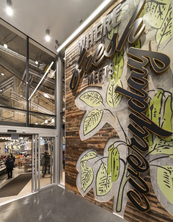
YELP CUSTOMER REVIEWInstead of trying to overcome the limitations of the space—ranging from its wedge shape and lack of solid exterior walls to mechanical intrusions like concrete pillars and a set of emergency elevator doors—KRS decided to incorporate these elements into the design. The goal was to tap into the quirkiness of the tower to add an urban twist to Fresh St. Market’s signature farm-to-market experience. The design gave a nod to the area’s industrial roots while highlighting the diverse choices in freshly prepared food and groceries.

Fresh St. Market – Vancouver House
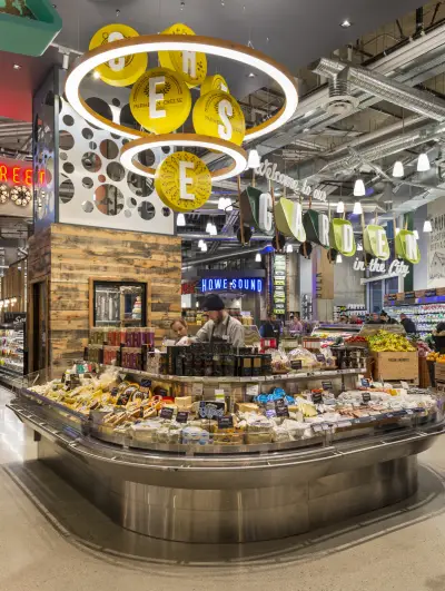
A series of hanging ceiling planes and public market signage would draw the visitor into the expanding array of themed food and drink areas toward the back of the store. Because the exterior walls of the space were more than two-thirds glass, a standard case layout wouldn’t work. However, since so much of the store’s interior would be seen from the street, KRS designed the lighting to showcase key areas like produce and cheese, but also pique the interest of people walking by.
“The opening has been fantastic, better than we expected. The response from local customers and people visiting from the food community has been great. . . Couldn’t be happier.”
MARK MCCURDYV.P. RETAIL OPERATIONS & BRAND STRATEGY
GEORGIA MAIN FOOD GROUP

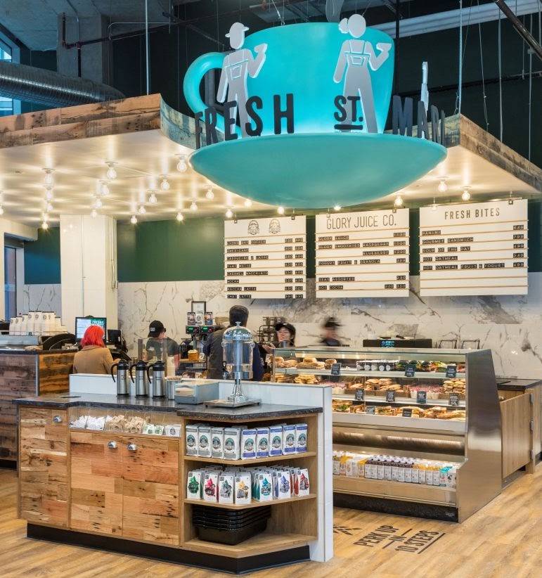
As part of implementing the design KRS manufactured the unique lighting, signage, and brand elements.
These included familiar icons like Fresh St. Market’s rustic windmill motif, as well as new ones like the full size wheelbarrows hung from the ceiling which display the GARDEN signage.
Now open, the store has lived up to its goal of becoming a food destination for the Granville district and north Vancouver, and has become the new exemplar of the ultimate Fresh St. Market store.
Summary
Fresh St. Market at Vancouver House faced the challenge of transforming a small, irregularly shaped, two-level space with limited parking into a functional and immersive grocery experience. King Retail Solutions embraced the site’s quirks—such as wedge-shaped layouts, glass walls, and mechanical intrusions—to create a visually striking, farm-to-market environment. The design highlights fresh food offerings, celebrates the area’s industrial roots, and draws customers from both local residents and the broader food community.
Key Takeaways
- The store had only 15,338 square feet spread over two levels, requiring creative spatial planning.
- Lack of parking necessitated a design tailored for frequent walk-in customers.
- KRS integrated architectural quirks—like concrete pillars, wedge-shaped space, and glass walls—into the design rather than fighting them.
- Hanging ceiling planes, public market signage, and strategic lighting guide customers through themed food and drink areas.
- Custom brand elements, including windmill motifs and ceiling-hung wheelbarrows, enhance the immersive farm-to-market experience.
- The design successfully turned a challenging space into a destination grocery experience for Granville District and North Vancouver.
- Fresh St. Market Vancouver House serves as a model for designing in unconventional spaces while maintaining operational functionality and brand identity.
Frequently Asked Questions
Q. What were the main challenges for designing Fresh St. Market at Vancouver House?
A. The store had a small, irregularly shaped two-level space, more than two-thirds glass walls, concrete pillars, mechanical intrusions, and no parking, all of which required a creative design approach.
Q. How did King Retail Solutions address the space limitations?
A. KRS incorporated the architectural quirks into the design, using hanging ceiling planes, strategic lighting, and public market signage to guide customers and highlight fresh food areas.
Q. What unique brand elements were implemented?
A. Custom elements included Fresh St. Market’s rustic windmill motif and full-size wheelbarrows hung from the ceiling displaying garden signage.
Q. How does the design enhance the customer experience?
A. The design creates an immersive farm-to-market experience that draws customers through themed areas, emphasizes fresh food offerings, and makes the most of visual engagement from the street.
Q. What has been the response to the new store design?
A. Local customers and visitors from the food community have responded very positively, and the store has become a destination grocery experience in Vancouver.

