Grocery store aisle signage has long been the unassuming hero of supermarket wayfinding. But the right grocery store aisle signs can transform your sign program from Clark Kent to Superman.
Aisle signs are, first and foremost, functional. Aisle markers, at minimum, feature easy-to-read aisle numbers and list product categories. But that’s no reason to assume they play an insignificant role in the customer experience.
Retail aisle signs are a vital part of your store decor package precisely because shoppers interact with them so much. Grocery store planning experts know these signs are not an afterthought but the backbone of navigation in the supermarket aisle. While designs and styles will vary according to the store’s overall décor package and brand, aisle signs should follow the basic tenets of good supermarket sign design.
What are the four unbreakable laws of aisle signs?
1. Grocery Store Aisle Signs Should Have a Consistent Design
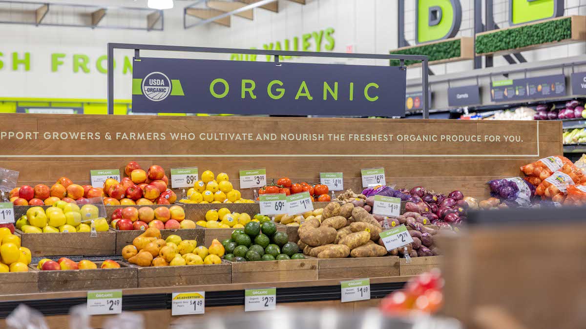
Because of their importance in wayfinding, maintaining a consistent design in aisle signage is essential to ensuring that shoppers can easily navigate your store. This is where supermarket design standards come into play.
An essential function of aisle signs is minimizing customers’ “Where are the…?” questions, which can consume employee time—something that is often in short supply. Whether customers need directions to the cereal, milk, eggs, bread, meat, cheese, peanut butter & jelly, yogurt, fruits, vegetables, pasta sauce, canned goods, snacks, crackers, soda water, beer, chips or ice cream, aisle signs form a critical piece of your overall retail interior design.
2. Aisle Signs Must Be ADA Compliant
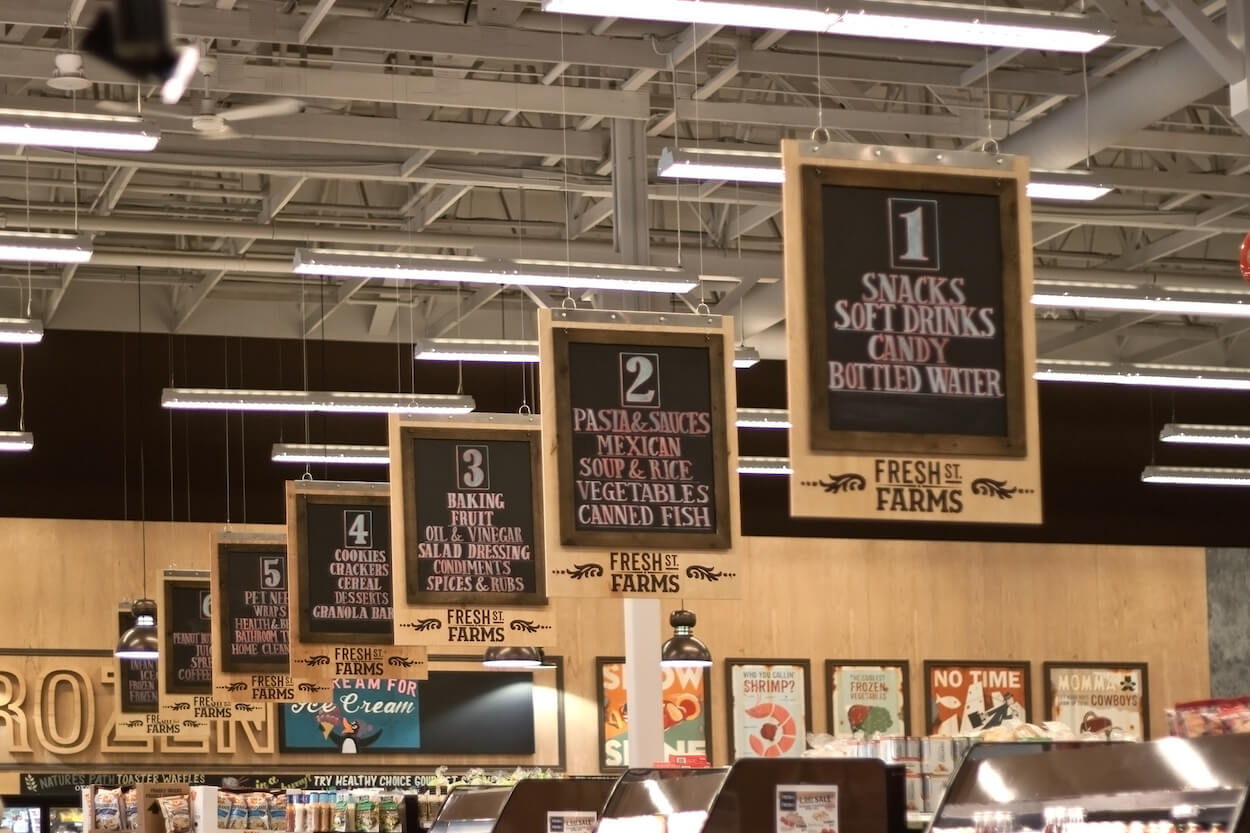
Regardless of the aisle sign style, every aisle sign must comply with ADA sign installation regulations:
- The bottom of an aisle sign must be at least 80 inches from the floor.
- Signage cannot project more than 4 inches into an aisle or pathway
- Signs can’t interfere with or block any door function, emergency equipment, or sprinklers.
3. Aisle Signs Should Be Easily Legible
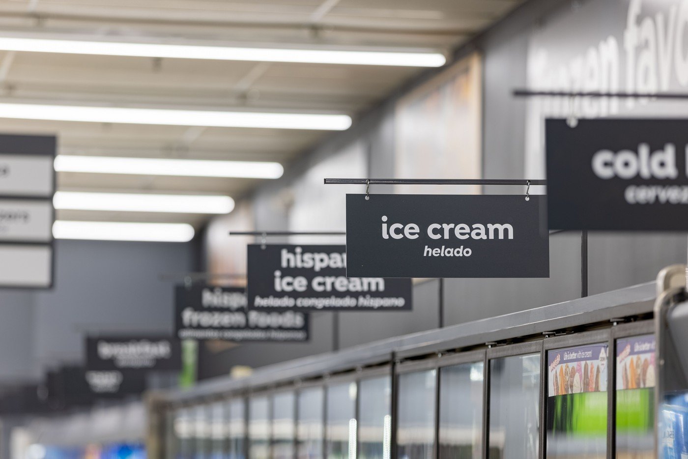
Legibility is critical for any successful supermarket signage design. While sans-serif fonts work best, they don’t have to be dull and dowdy. Many contemporary sans serif fonts are legible and can express your store brand’s personality.
Use a font that contrasts with the background; keep backgrounds solid. Light type on dark backgrounds can convey a more upscale aesthetic but can also be harder to read than dark-over-light.
A light-on-dark design will generally require a bolder or larger font. This color combination can also be effective when used on signs closer to supermarket shoppers, such as those on gondola shelving.
4. Aisle Signs Should Be An Integral Part of Your Grocery Store Decor
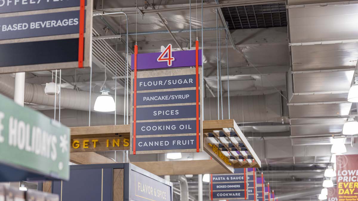
Aisle signage doesn’t have to be a “necessary evil.” Executed well, it can enhance and amplify your store decor while still conforming to supermarket design standards. A great example of well-integrated aisle sign design is central to the Lucky stores in Northern California, for which King Retail Solutions manufactured signage, decor, and fixtures.
The Lucky aisle directory program expresses a clean, fresh, and modern design and utilizes different applications of one master font throughout the store. That font appears on everything from aisle signs to dimensional wall signage, carried out in different colors and materials. Using a master font creates a unifying design “throughline” within the store.
For Lucky, a playful aisle sign “frame” combines vibrant poppy red and violet hues. Red aisle numbers are outlined in white to enhance legibility.
The colors contrast nicely against the grey sign panels and white type—a neutral combination that signals this as the place to look for information. These elements are mounted on wood-look background panels to underscore a message of offerings that are “natural and healthy.”
Types of Grocery Store Aisle Signage
There are three primary types of signs used in grocery store aisles:
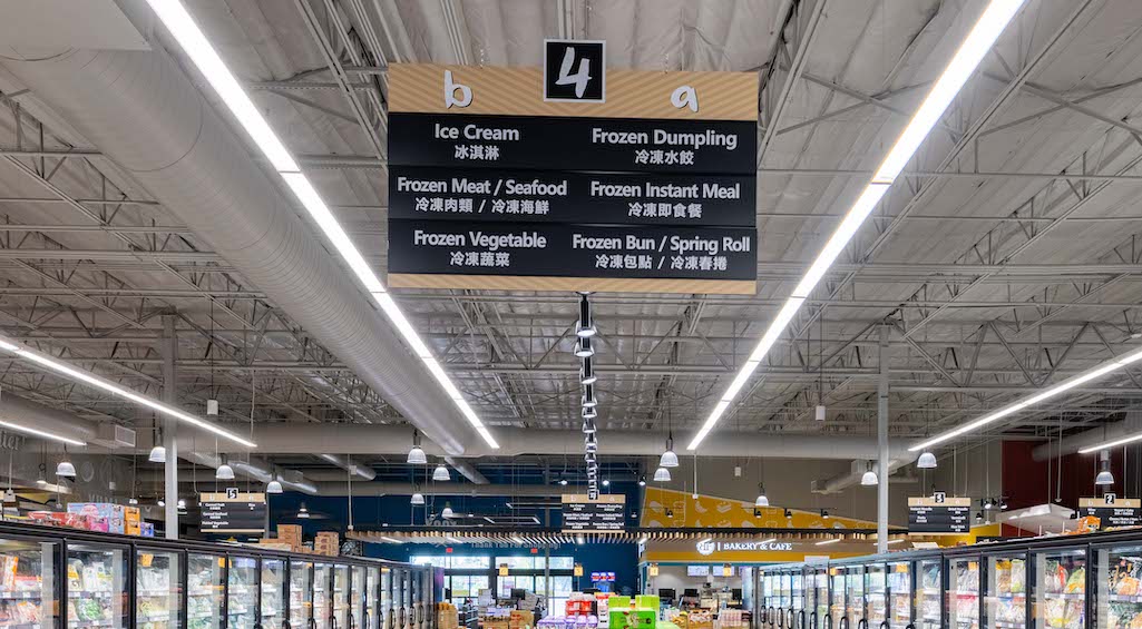
Hanging Aisle Signs
Most commonly used in supermarkets, hanging aisle signs offer optimal visibility. They’re hung centered over the aisle and are usually symmetrical because they’re typically two-sided.
Hanging aisle directories look and work best in stores with high ceilings. In older buildings with lower ceilings, as well as in small urban markets and convenience stores, signs mounted on shelving tend to work better.
Gondola Shelving Aisle Signs
These aisle signs are mounted to gondola shelving, most frequently on the endcap or mid-aisle.
Aisle signs can be placed parallel or perpendicular to shelving, depending on location and shopper traffic patterns. Gondola-mounted aisle signs that face the “racetrack,” the wider perimeter aisle, can set the tone for the shopping experience.
Shelf-mounted aisle markers are typically built on metal frames from which the printed signs are suspended. Metal brackets for aisle signs should be adjustable in height. This ensures that all grocery store aisle signs appear at the same height, regardless of the shelving fixture to which they are attached.
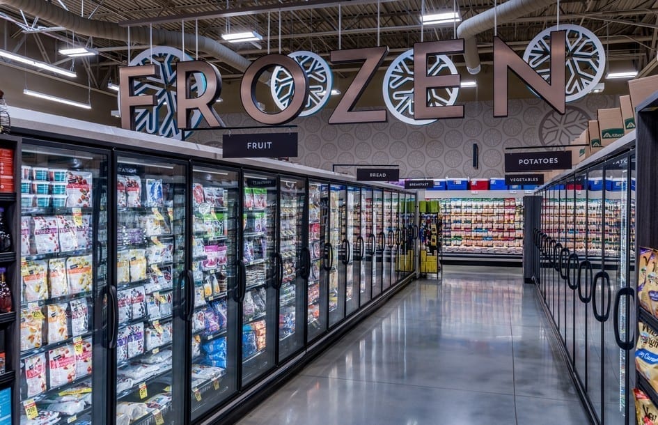
Grocery store outrigger signs are mounted to the tops of gondola shelving units. Pendant signs are suspended from L brackets, which hold pendants on one side, or T brackets, where pendants are hung on each side. Because of their generally smaller size, it’s important to ensure that the lettering on pendants is easily legible.
Gondola Aisle Sign Holders
Header frames can hold items such as a sign insert or a suspended sign. Because these can be significantly larger than gondola pendant signs, it’s an excellent place to utilize unique design ideas or simply more decorative font styles. They can also integrate with other aisle marker signs in your decor package.

Enchanting Aisles
The way store aisle signs are being used today reflects changes in the design of grocery store layouts. The traditional supermarket layout of long, unbroken aisles is an artifact of “transactional” retail stores, where the shopper moved through the store collecting products.
With today’s grocers vying to offer their customers an emotionally engaging experience, those long grocery aisles are being disrupted. Changing the flow breaks up the monotony of trooping up and down rows of shelves and encourages discovery—which triggers impulse shopping and higher sales.
In contemporary grocery store designs, center-store space creates captivating new shopping and dining experiences. In the past, the idea of ‘hanging out’ in a grocery store was less common, but retailers are now doing their best to move beyond mere “grocery shopping” and keep customers in their world as long as possible.
This shift presents a new challenge for wayfinding and an evolution of supermarket signage design. Not every shopper, every time, wishes to “discover” or “experience.” Some customers want to get through their lists as fast as possible, get their food and other groceries in the cart, and get home.
To meet both requirements of providing an experience and a utilitarian approach to shopping, clear, easy-to-read, and helpful grocery store aisle signs are more important than ever. Doing so requires thoughtful store signage to help customers re-orient themselves after passing through a delightfully distracting “experience zone.”
Are Custom Aisle Signs Affordable?
Reflecting the old belief that supermarket aisle signs are simply a commodity, many retailers opt to purchase off-the-shelf designs for their grocery store signs. Unfortunately, these generic signs don’t express their brand and can strike a flat note in otherwise well-designed stores. Due to potential overseas supply chain issues, off-the-shelf signs may have similar lead times to custom signs made domestically.
King Retail Solutions produces signs and store decor in our 100,000-square-foot production facility in Eugene, Oregon. We manufacture signs from wood, metal, and plastics. Regardless of the vendor who designs your fixtures and decor, KRS works rapidly through prototypes, revisions, and manufacturing. A KRS specialty is value engineering, ensuring that everything we produce is as budget-friendly as it is beautiful. Custom aisle signs are a surprisingly cost-effective alternative to off-the-shelf products.
Today’s retailers know that a customer’s attention is a precious asset. You’ll capture more of it when you combine essential wayfinding information with eye-catching design.
Summary
Grocery store aisle signs are more than functional wayfinding tools—they shape the shopping experience, support brand identity, and guide customer behavior. When designed and installed thoughtfully, aisle signage improves navigation, reduces staff interventions, and enhances the store decor. Consistency, legibility, ADA compliance, and integration with overall store aesthetics are essential to an effective aisle sign program.
Key Takeaways for Grocery Store Aisle Signs
- Maintain a consistent design across all aisle signs to ensure shoppers can easily navigate the store.
- Ensure ADA compliance: minimum 80-inch clearance from the floor and no obstruction of doors, sprinklers, or pathways.
- Use legible fonts with strong contrast against solid backgrounds; sans-serif fonts are preferred for readability.
- Integrate aisle signs with overall store decor, using colors, materials, and typography that reinforce brand identity.
- Types of aisle signs include ceiling-hung, gondola-mounted, and shelf-mounted headers or outriggers—choose based on ceiling height, store layout, and shopper traffic.
- Custom aisle signs can be as cost-effective as off-the-shelf solutions when value engineering and domestic fabrication are applied.
- Proper planning ensures signage supports both utilitarian shopping and immersive, experiential store layouts.
- Expert design and project management streamline rollout, installation, and consistent execution across multiple store locations.
- Attention to detail in aisle signage increases customer engagement, reduces confusion, and drives sales.
Frequently Asked Questions
Q. How often are grocery store aisle signs updated?
A. Permanent décor is typically refreshed every 5–12 years, while promotional or temporary signs may change as often as weekly.
Q. Who decides which products are featured on the aisle signs?
A. The retailer’s merchandising team, sometimes in partnership with category captains, determines product placement and copy for aisle signs.
Q. What types of grocery store aisle signs exist?
A. Hanging aisle signs, gondola shelving signs, and gondola aisle sign holders are the primary types, chosen based on store layout, ceiling height, and shopper visibility needs.
Q. How does signage design impact the customer experience?
A. Effective aisle signage enhances wayfinding, communicates brand tone, educates shoppers on products, supports operational and safety requirements, and reduces customer confusion.
Q. Are custom aisle signs affordable?
A. Yes—domestically fabricated custom aisle signs with value engineering can be surprisingly cost-effective, often outperforming off-the-shelf signs in brand impact and installation speed.
